


How Do You Design a Character?
I have designed more than 400 characters and mascots in over 20 years.
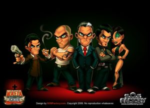
This is my character design process, shown on one real client project from the brief to the final color: five characters and a group illustration for Mafia Death, an online game about mafia families. I first published it here in 2008, and later as a tutorial on Tuts+.
The steps are the ones I follow with every character, from a game hero to a brand mascot.
Step 1: Describe each character before drawing
The order was five characters and a logo. Each character had to work alone and in a group shot. Before any sketch, I wrote a description of how each one behaves, and gave each one a famous face as a casting reference:
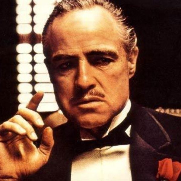
The Boss
Vito Corleone
The family's chief. With a raise of an eyebrow you are a dead man. Not very talkative, not especially strong. His best weapon is his brain.
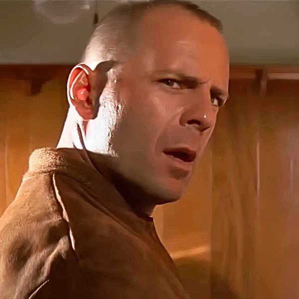
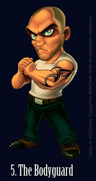
The Bodyguard
Bruce Willis
The muscle of the team, the one who fixes the loose ends. His favorite sound? The crack of a breaking neck. If you see him parking in front of your house, you have less than 10 minutes to write your will.
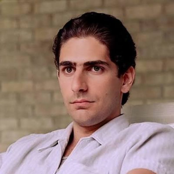
The Latin Lover
Michael Imperioli
He negotiates the important deals. Smart, attractive and athletic, with a fine taste for clothes and women. He has a weakness for blondes. If you go out at night with him, tell your parents you won't be home before noon.
The Girl
Angelina Jolie
Only her sensuality matches her wickedness. Cold and calculating, a precision weapon that works on men and women alike. The last one who compared her to Angelina Jolie is dead.
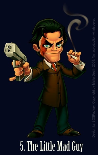
The Little Mad Guy
Joe Pesci
His motto is "Surviving is irrelevant, what matters is how many you take to the graveyard". So insane he is only useful in desperate missions. Joe Pesci fan. And don't ask about his scar.
Describe behavior, not looks. "With a raise of an eyebrow you are a dead man" gives the designer a face, a pose and an attitude. "Serious, wears a suit" gives nothing to work with.
The famous faces work the same way: they point to a stereotype everyone knows, not to a face to copy. The character still needs its own look. If the drawing ends up as a caricature of the actor, it is a portrait, not a character.
Step 2: Sketch the attitude first
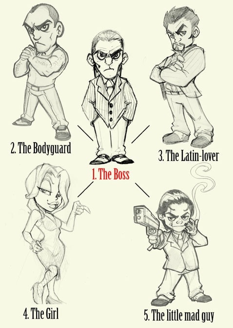
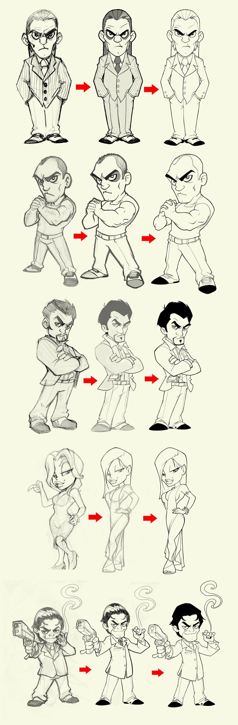
An illustrator friend, Miguel Ruiz, drew the first sketches from those descriptions. The style was not mine, and at this stage it does not matter: the color and the line come later.
What I check in each sketch is the attitude: the pose, the facial expression and the clothes.
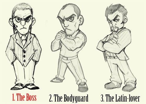
- The Boss: exactly what we needed. A relaxed pose with a lot of strength in the look. The legs were short and the waist too wide, but easy to fix.
- The Bodyguard: good face, but the hands and the left arm needed work.
- The Latin Lover: the pose was too lateral. There was no room for the chest or the gun, so he had to be redrawn almost from scratch.
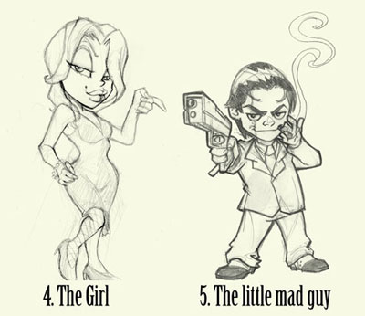
- The Girl: she looked too 1920s Chicago and needed a modern look.
- The Little Mad Guy: the right attitude, but he looked too young, and his arms were too short to read the pose.
A sketch can be technically wrong and still be a good start: the attitude is the hard part.
Step 3: Give each character a shape
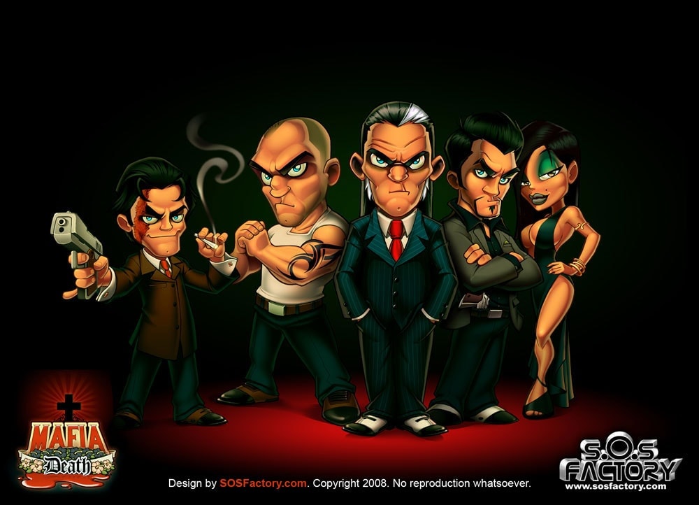
Before anyone reads a description, they read shapes. Round shapes feel friendly, squares feel strong and stable, and sharp angles feel fast or dangerous. You can see it in the final group:
- The Boss: a tall rectangle. Straight suit, hands in his pockets, nothing breaks the outline. He does not need to move.
- The Bodyguard: a heavy block. Wide shoulders, thick arms and a round, bald head: pure mass.
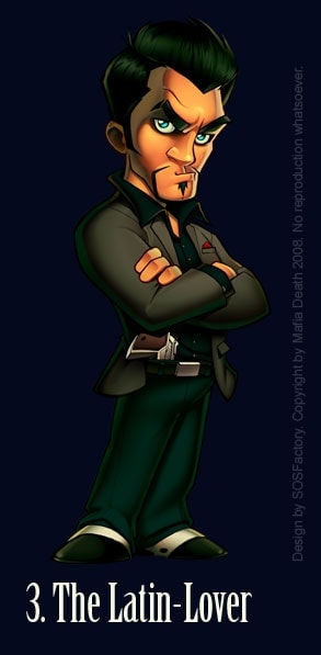
- The Latin Lover: angles. A pointed beard, spiky hair, sharp eyes and crossed arms.
- The Girl: curves. Long wavy hair, a hand on the hip and an S-shaped pose. A soft outline with a cold look.
- The Little Mad Guy: the smallest, but the gun and the cigar stick out of his outline. He is the one who cannot stay still.
When the shapes match the descriptions from step 1, the character tells its story without a word of text.
Step 4: Compose the group
When several characters appear together, the order tells who matters. The Boss goes in the center.
The Bodyguard stands on his right, as his right-hand man, and the negotiator on his left, completing the trio of important characters. The Girl stands next to him, and the short guy goes on the opposite side to balance the weight.
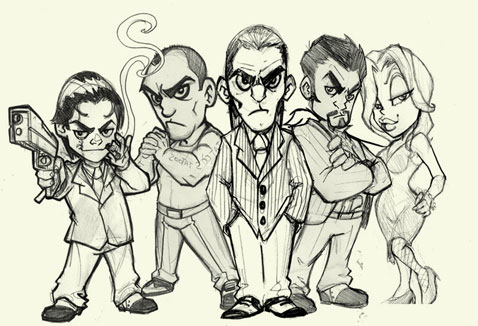
Together they looked better than I expected. This is the moment for the silhouette test: fill each character in black.
If you can still tell who is who, and where one ends and the next begins, the poses work. If not, one of them has to change.
Step 5: Clean the sketches
From here on I work digitally, in Photoshop with a Wacom Cintiq. I redraw each character until every shape is clear, using old sketches, other designs and photos as reference.
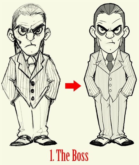
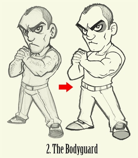
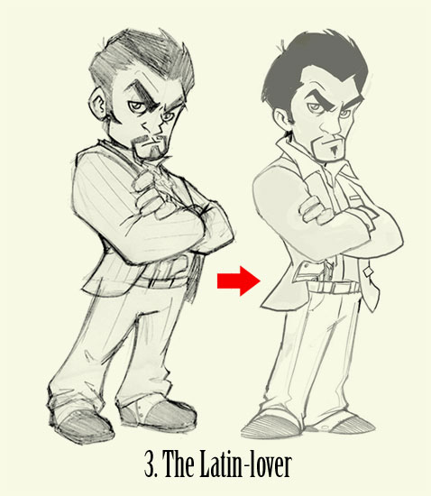
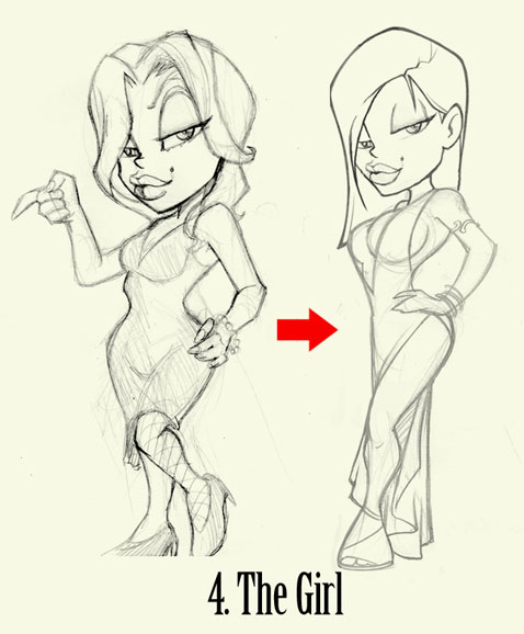
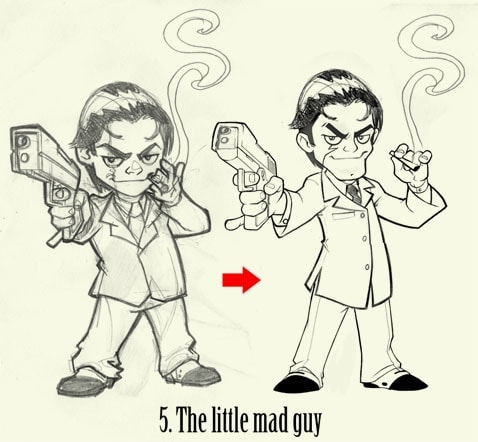
The first two characters only needed corrections. The other three were almost redrawn. That is normal: the sketch gives you the idea, the cleaning gives you the character.
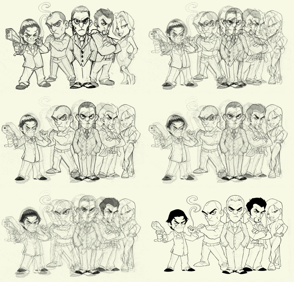
Step 6: Ink the final lines
With the drawings clean, I ink them in Photoshop. There is no secret here, only practice: thick lines for the outer contour, thinner lines inside, and only the internal lines that explain the volume.
Step 7: Choose a palette that fits the theme
I usually color with very bright cartoon colors. For a mafia game I wanted something fun but mysterious, with softer colors and strong dark tones. I colored the Boss first to set the palette for the rest.
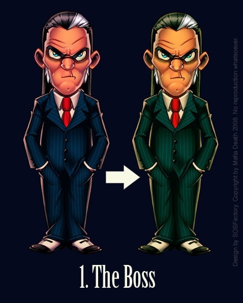
The first version with cold colors worked, but warmer and more worn-out tones matched the theme better. I did not color it again: a Color Balance adjustment in Photoshop (Ctrl/Cmd + B) changed the whole palette in seconds.
With the palette defined, the rest goes faster. Each character looked good alone but too heavy next to the others, so I softened the colors.
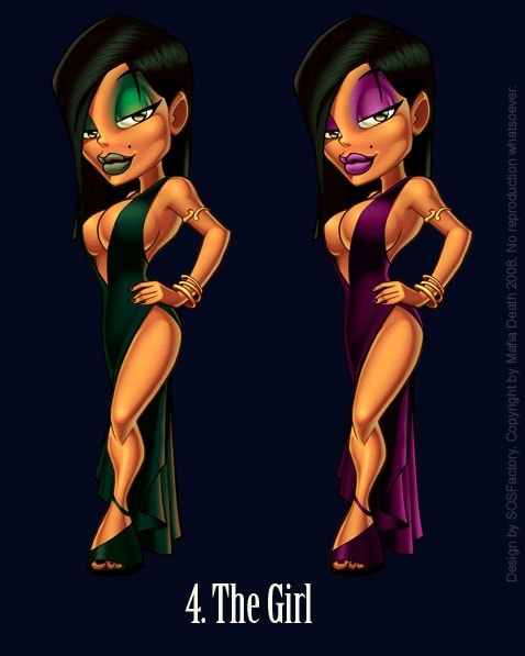
The Girl showed the classic conflict: the purple version catches more attention, but the green one fits the group. My choice was to sacrifice the character for the illustration.
The client preferred the purple at first; in the final illustration she wears the green.
Step 8: Adjust the characters as a group
Characters that work alone do not always work together. In the final illustration I corrected the colors of each one so the five read as a single team, with one light source and the same contrast.
A quick check: look at the group in grayscale. If two characters turn into the same gray, one of them needs more contrast.
The same happens with a brand mascot. The character has to work alone on a business card and next to your logo, your packaging or other poses of itself. Checking it as a group before closing the design saves corrections later.
When it pays to hire a mascot designer
If you are learning to draw, these steps are a good way to practice.
If the mascot is for your business, the drawing is only half the job: the character has to fit your brand, stand apart from your competitors and work in every format, from the logo to the packaging. That is what a professional designer brings, together with the source files and the rights to use the character.