How to Design a Mascot Logo
What Is a Mascot Logo?
A mascot logo is a logo built around a custom character that represents the brand: a simplified mascot paired with the brand name. It combines the fun and approachable feel of a mascot design with the simplicity of a logotype.
Or, put another way: it’s what you get when a logo and a cartoon character fall madly in love, spend one unforgettable night together… And nine months later, boom: brand baby.
If you’re looking for inspiration, check out my mascot logo gallery, or visit my custom mascot logo service page if you need a design for your brand.
When Should a Brand Use a Mascot Logo?
It works great for B2C businesses like sports teams, food brands, gaming, personal branding and family businesses. Why? Because mascot characters are a magnet for attention, build connection and make people remember you.
When a Mascot Logo Is Not a Good Fit
- You need to look institutional or risk-averse: if your brand relies heavily on authority or compliance, like a bank, government agency or insurance firm, a mascot can feel off-brand (unless that contrast is intentional).
- You want a quick, low-effort solution: good mascot branding requires multiple variations and layouts. If you’re still figuring out your brand voice, audience or values, it may be better to hold off until those foundations are clear.
- You want a purely abstract identity: mascots are figurative by nature. If your brand is built around abstract ideas, a mascot might add too much narrative.
- Your brand needs to project neutrality or anonymity: some companies want the focus on the product or service. If your goal is to keep things visually timeless and free of personality, the mascot’s expressiveness might not fit.
- Your communication is strictly formal B2B: industrial suppliers or consultancy firms, for example.
Mascot Logo vs Mascot Icon vs Mascot Design: What Is the Difference?
I won’t bore you with technical jargon. Let’s keep it intuitive.
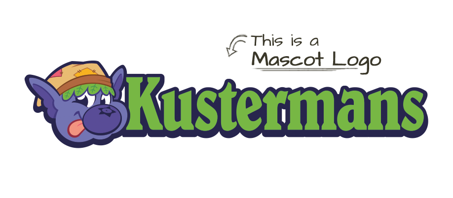
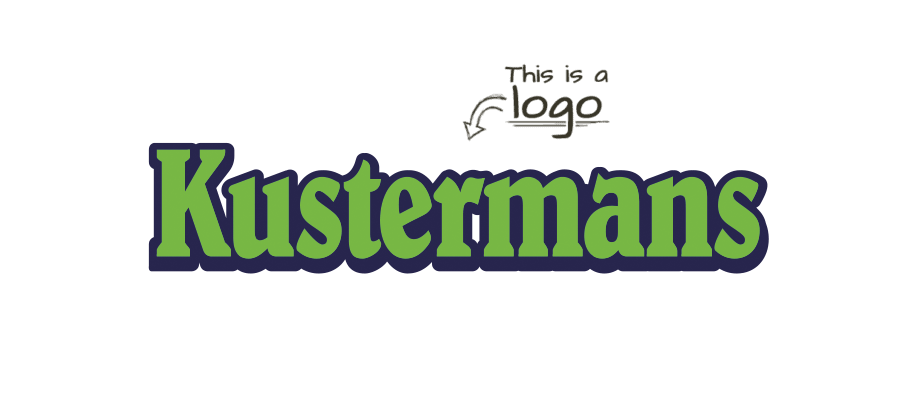
A mascot logo combines a simplified mascot illustration (the icon) with branding elements like typography (the lettermark), following all logo design principles: it must be simple, versatile, iconic and memorable.
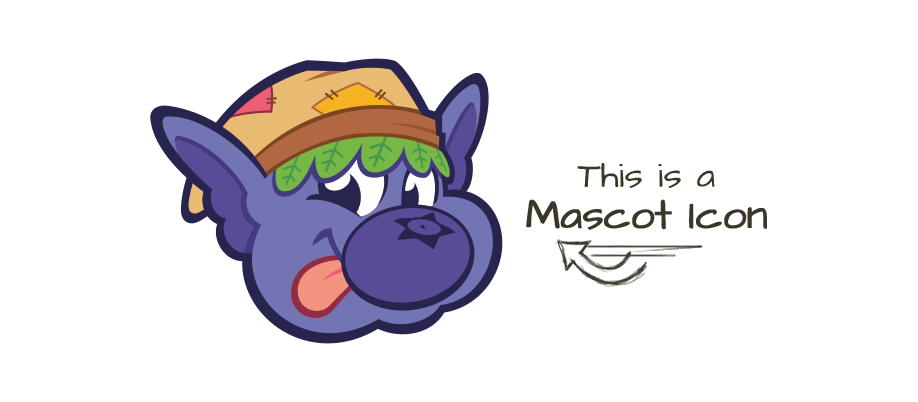
A mascot icon is a simplified version, usually just the head or a simplified full-body pose, used in small formats like social media avatars, app icons or favicons, where space is limited but visual identity must remain strong.
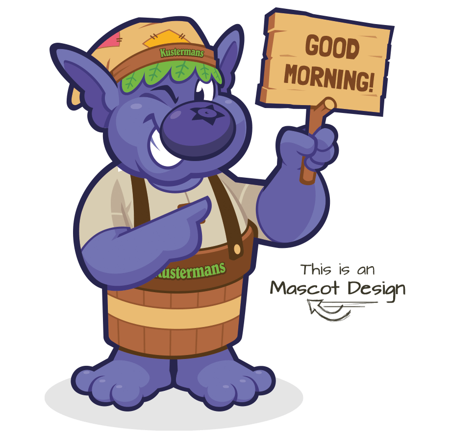
A mascot design, on the other hand, focuses solely on the character and is often used across marketing, packaging and digital media as a brand element. It’s more of an illustration than a logo, so it’s best used in larger formats like packaging, ads or marketing materials. Scaling it down often means losing important details.
The mascot logo as an individual design element is outdated. Nowadays, in mascot branding, we think about a design system.
How to Design a Mascot Logo, Step by Step
This is my full process to design a mascot logo, from the brief and the first ideas to sketching, refining with grids and the final branding system.
Step 1: Write a Clear Brief
Every mascot project starts with clarity. Before I draw anything, I need to understand the brand, the audience and the message. If you’re not sure how to write a design brief, this article on how to brief a designer covers the essentials, even if you’re not a creative professional.
Step 2: Brainstorm Ideas
This is the messy, creative part: gathering references, sketching loose ideas on paper and exploring different directions. I don’t use AI here or in any other step: every mascot and logo I design is drawn by hand. At this stage I’m only opening up options; the final look comes later.
Step 3: Sketch with Basic Shapes
Build the character from overlapping circles and basic shapes, and fix structure, balance and proportions before you add any detail. A solid base makes every later change easier. In the video I walk you through it step by step.
Step 4: Sketch a Real Mascot
Apply the same shapes to a real brief and let the drawing flow. Once the structure is in your hand, you stop thinking in circles and start drawing the character. The video shows it on a cow mascot logo, with no explanations.
Step 5: Refine with Grids
Turn the loose sketch into clean lines with grids, circles and proportion rules, refining each curve until the icon feels balanced and consistent. That precision is what makes it ready for vector work. The video shows the whole refinement.
Step 6: Build the Branding System
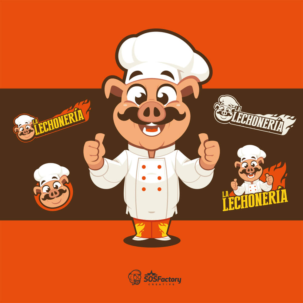
A mascot logo is never a single file. Deliver the logo system with named versions, a 1-color version, collateral, a mini guide for type and color, and a short time-lapse of the mascot. The video covers all five pieces.
Want to go deeper? Here’s a detailed post on how I use grids in mascot logos, and Grid Systems in Graphic Design is a good book to start with.
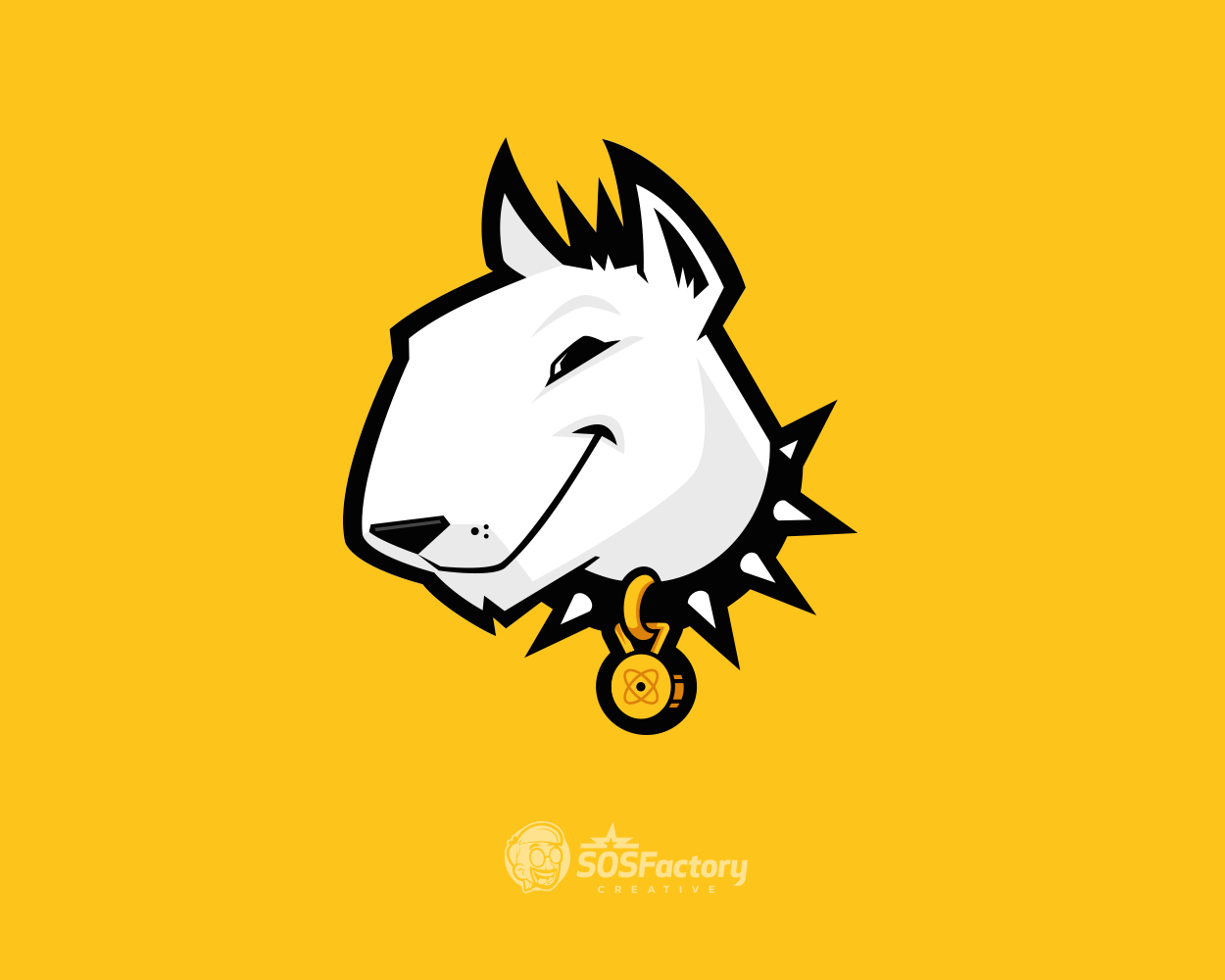
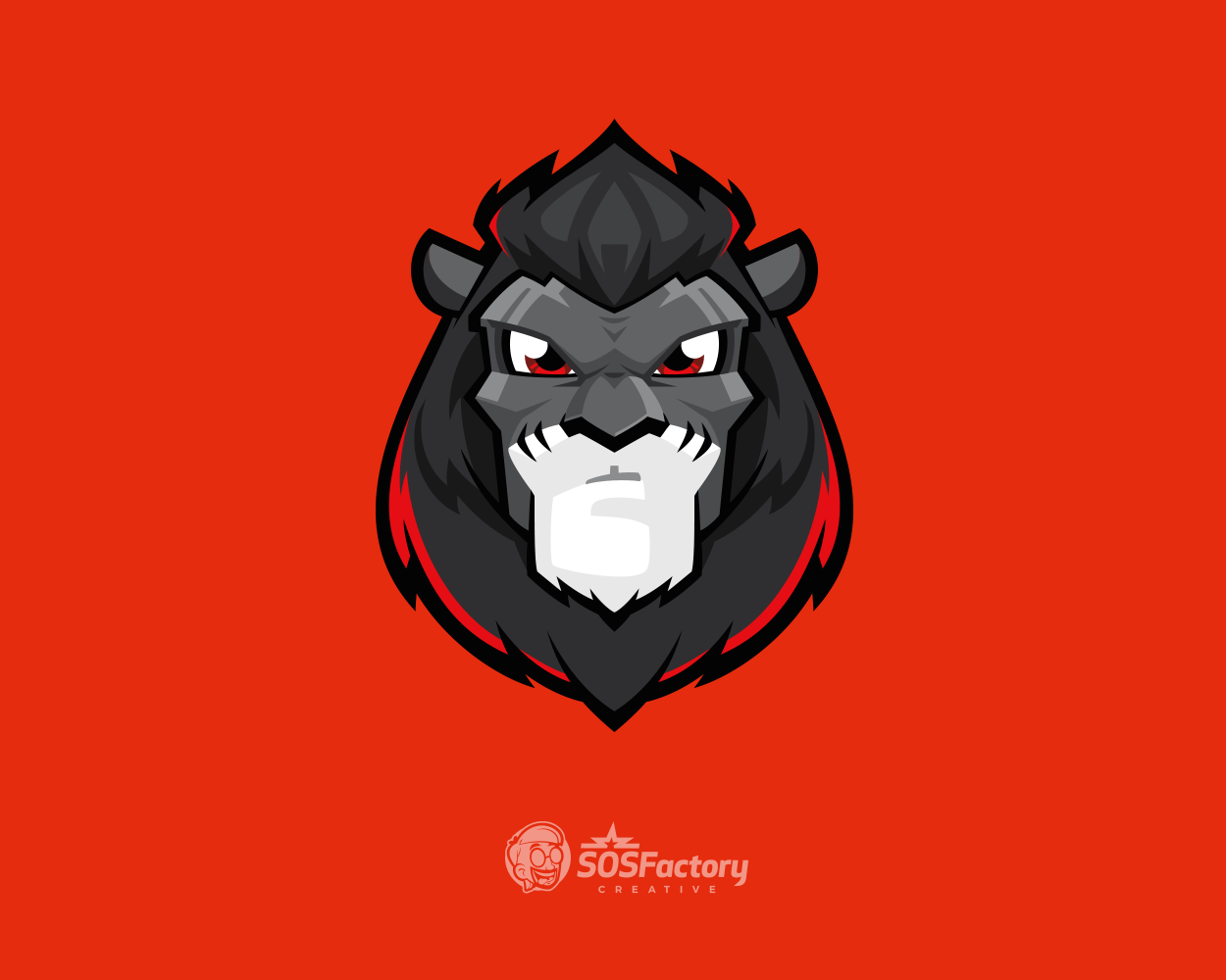
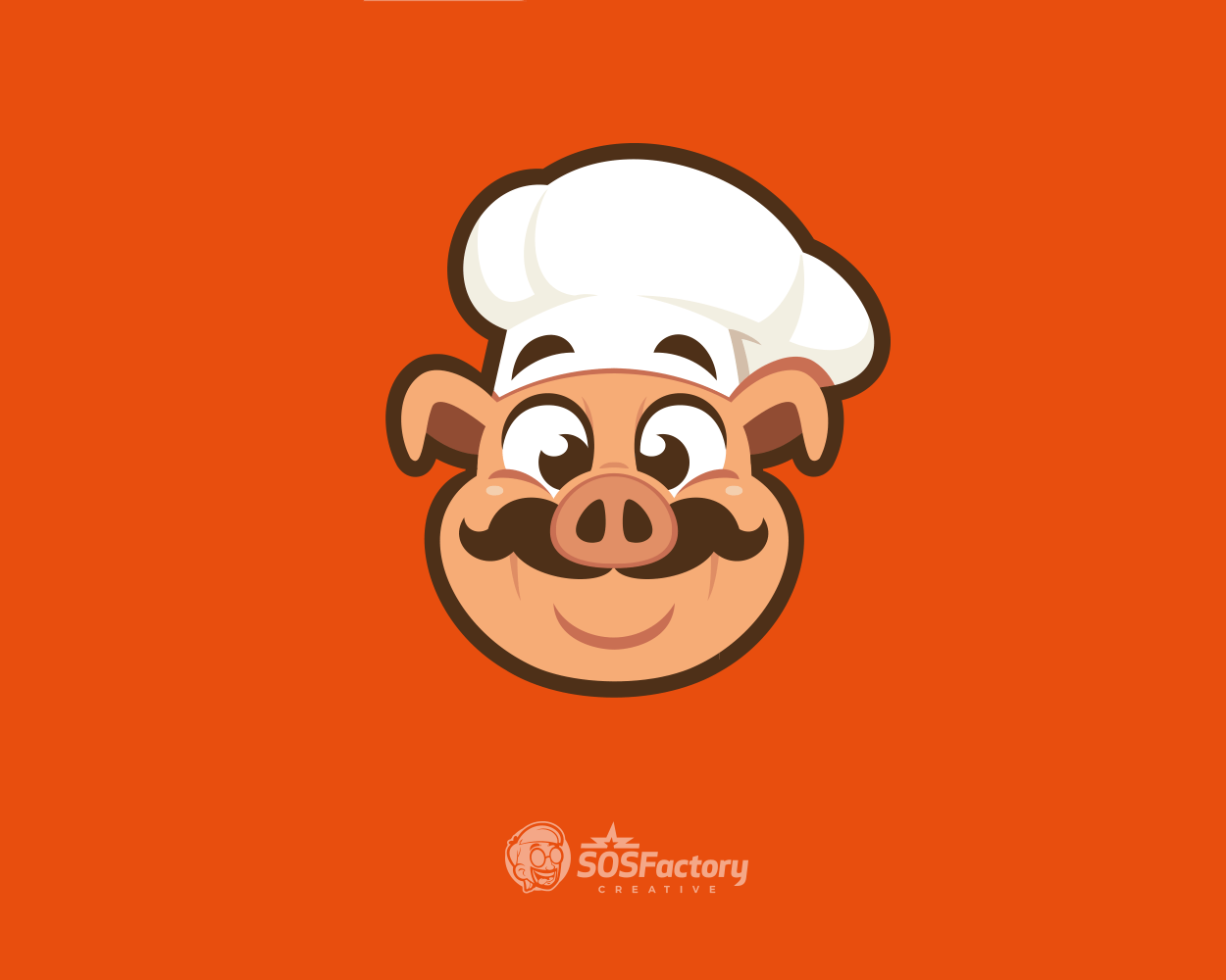
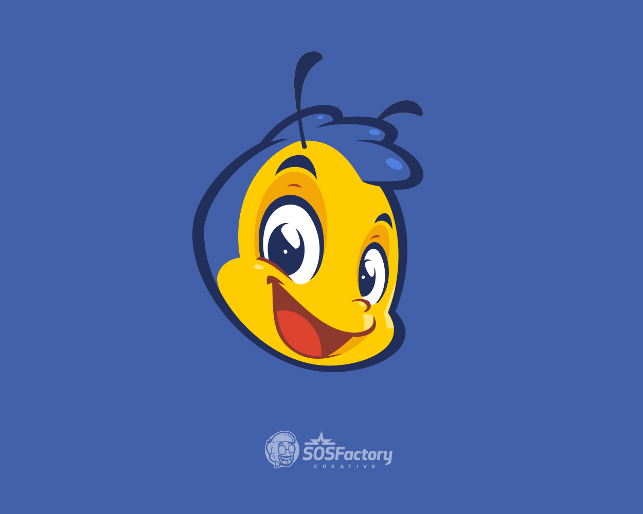
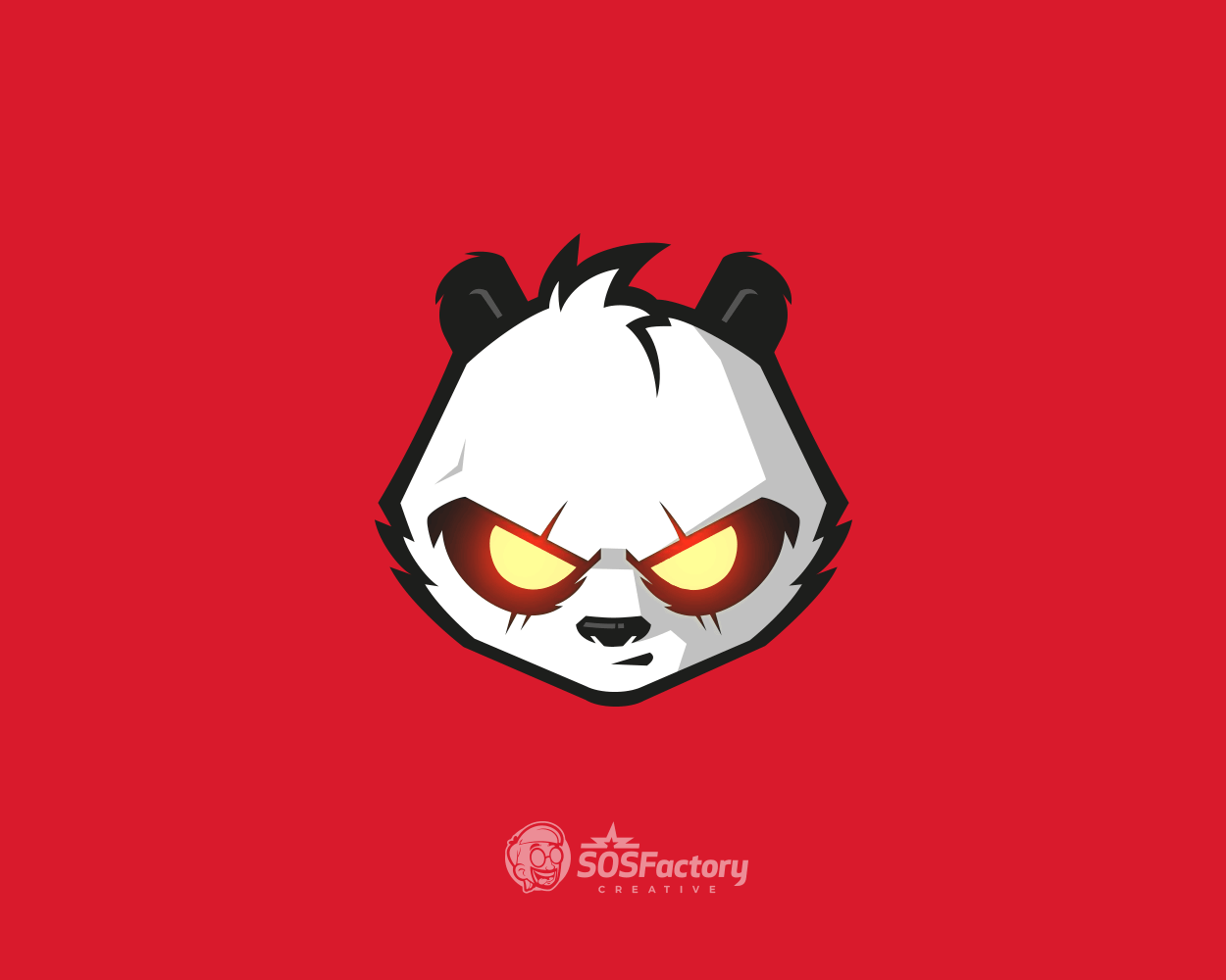
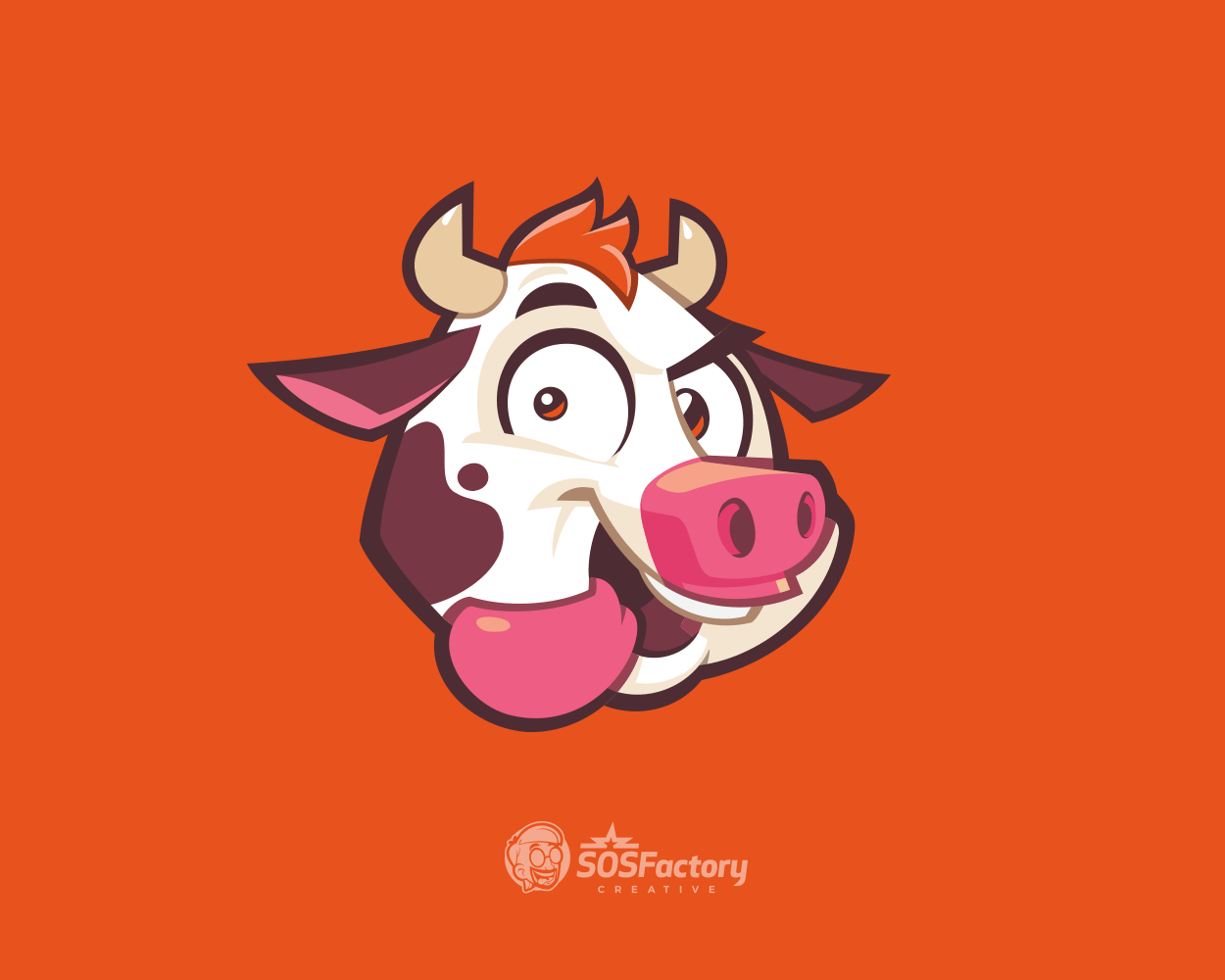
Here are a few mascot icons created by following the steps above. For more examples, browse the full mascot logo gallery.
How to Integrate a Mascot into a Logo
Throwing a cartoon character next to some text doesn’t make it a logo.
If you want it to work, the character needs to feel part of the logo, not just stuck on. That means thinking about format, size and how it’ll be used. Sometimes it’s just the head. Sometimes it lives inside a badge. Sometimes the mascot sits out completely, and that’s okay too.
Below, I’ll walk you through different ways to integrate a mascot into a logo, starting from the most compact and versatile to the more complex setups used in larger formats.
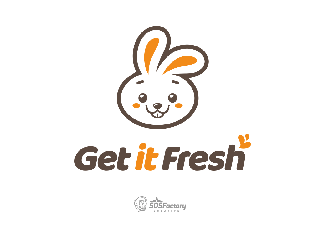
Head Icon Separated from the Lettermark
A super simple and versatile setup. The mascot head stands alone as an icon, while the text handles readability. It works great in small formats and keeps the branding clean.
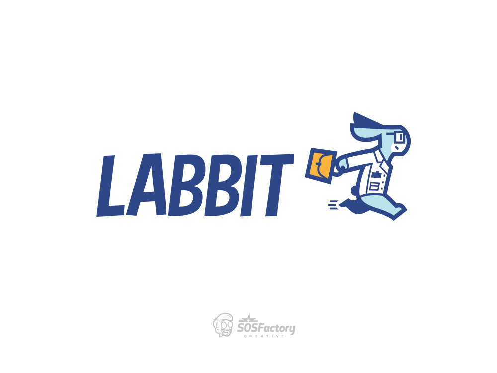
Full-Body Mascot Separated from the Lettermark
A slightly more complex setup. The full-body mascot adds expression and movement, but it needs to be simplified to stay readable at smaller sizes.
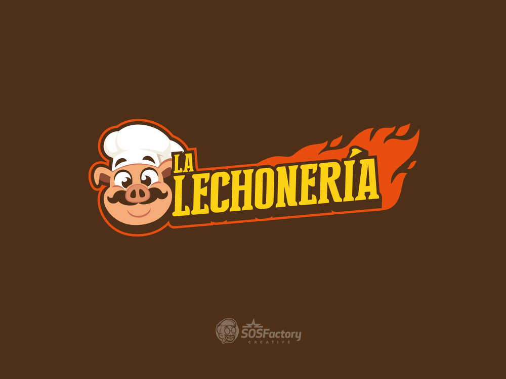
Mascot Head Integrated with the Lettermark
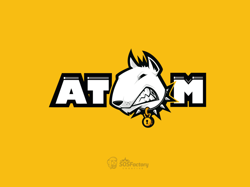
The mascot head is integrated into the logo, making it visually strong but slightly less flexible. It’s a more complex setup, though elements can be separated when needed.
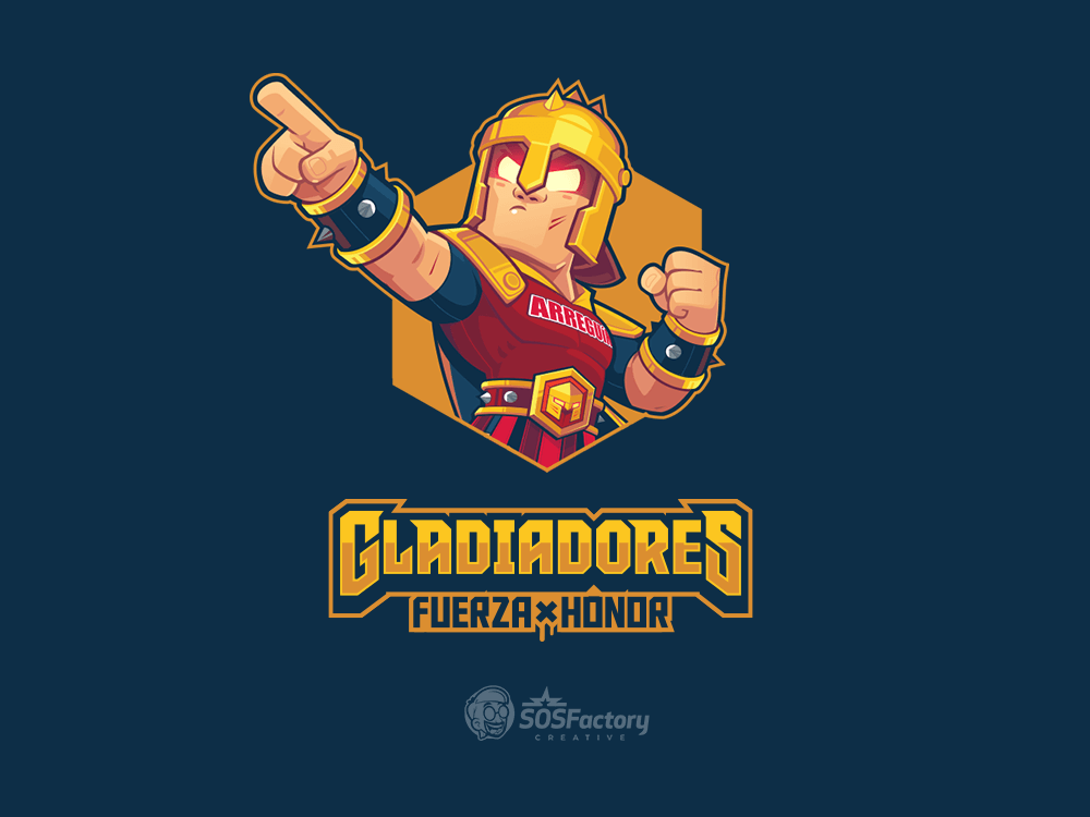
Half-Body Mascot Next to the Lettermark
A detailed half-body pose placed beside the wordmark. It’s bold and expressive, ideal for high-impact visuals, but the complexity means you’ll need simplified versions for smaller applications.
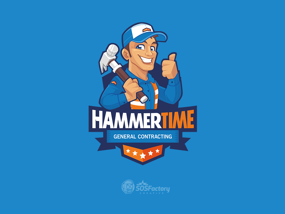
Half-Body Mascot in a Badge Layout
The mascot and logo are combined as a complex badge. It’s great for packaging, signage and branding kits, but it’s not scalable. Always pair it with simplified alternatives for flexibility.
Common Mascot Logo Mistakes (and How to Avoid Them)
I’ll be honest: it took me a few years to understand why my initial approach to mascot logos used to fail. I still struggle to merge strong illustration with solid logo design principles.
There are usually two types of creators in this space:
- Graphic designers who understand how to build scalable, versatile logos but often lack visual impact, resulting in very generic mascots.
- Illustrators who create stunning artwork but fail to simplify it enough to work in all possible scenarios.
Let’s break down the most common issues.
My Mascot Logo Doesn’t Scale Well
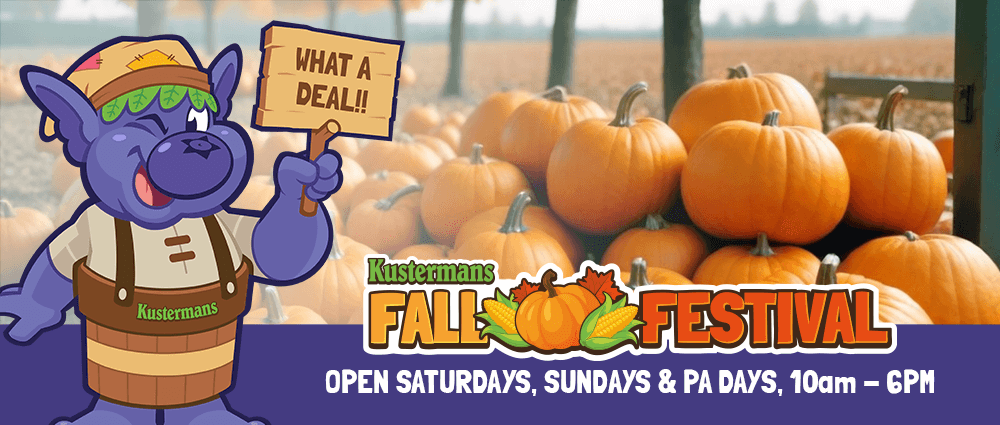
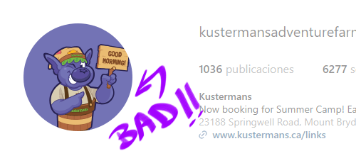
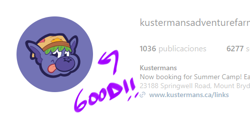
Mascot characters often look great on big applications like billboards or van wraps, but they weren’t built to work at smaller sizes. When reduced to an app icon or social media avatar, details get lost and the character becomes unreadable. This is where the mascot icon comes into the scene.
Remember to use the right brand element for each format.
My Mascot Branding Doesn’t Work in 1 Color
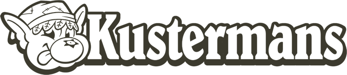
If your mascot logo falls apart when converted to 1 color or when used very small, that’s a problem. Logos should be adaptable and still recognizable with no gradients, textures or color. A strong mascot logo must work across all formats: full color, flat, monochrome, embroidery and print, without losing its identity.
Remember the mascot is just another asset. It is completely fine to use only the lettermark when the conditions are so restrictive that the mascot logo won’t look good. Nowadays applications are so diverse that it is time to think about branding kits, not just a single logo!
Notice that the simpler the logo is, the bigger it looks within the same area, so it’s more readable.
My Mascot Logo Scales Down Well but Looks Generic When Used Big
Some mascot logos are technically well designed: clean lines, good proportions and simple shapes. They work great as an icon, but they don’t stand out or build any emotional connection, which makes them forgettable. For certain industries this is a no-go.
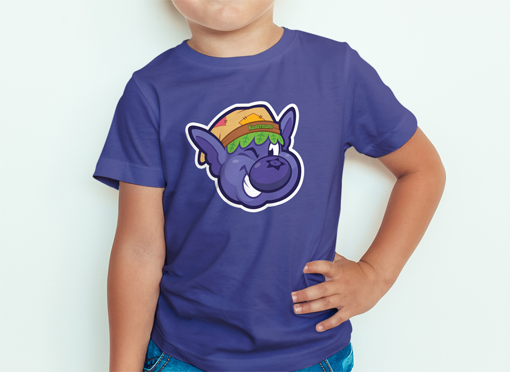
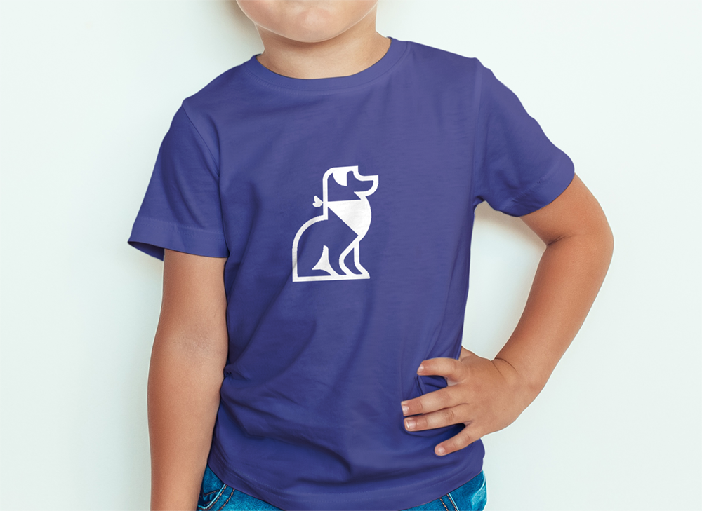
Mascot Logo Examples from Real Projects
You’ve heard the theory, now let’s look at some real-world applications. Below are a few mascot logos I’ve created for clients across different industries. Each one balances personality with usability and was crafted to work both as a character and as a brand asset.
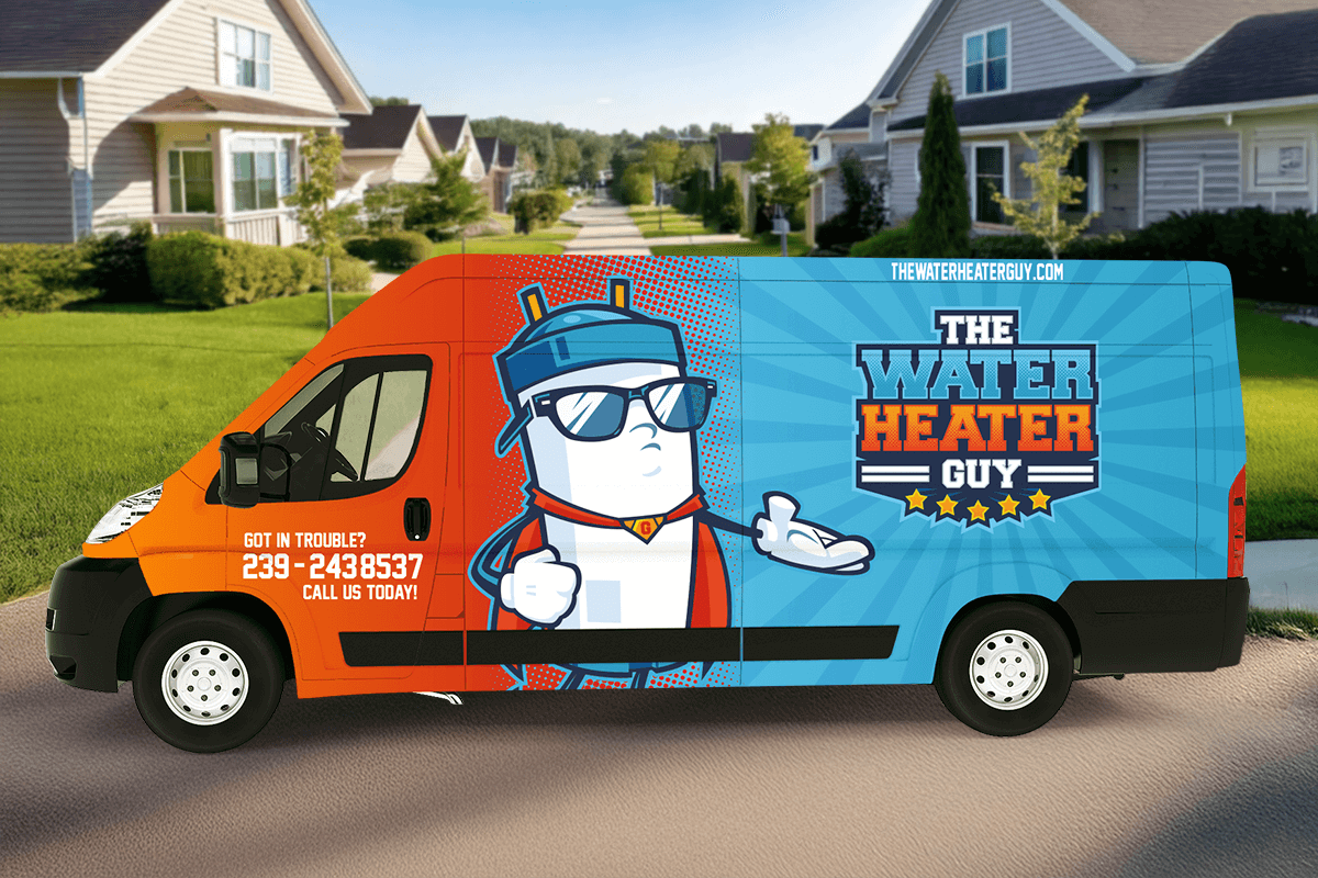
Mascot Logo for a Plumbing Company
The Water Heater Guy is a trusted plumbing company in Southwest Florida that offers superior and reliable repair service.
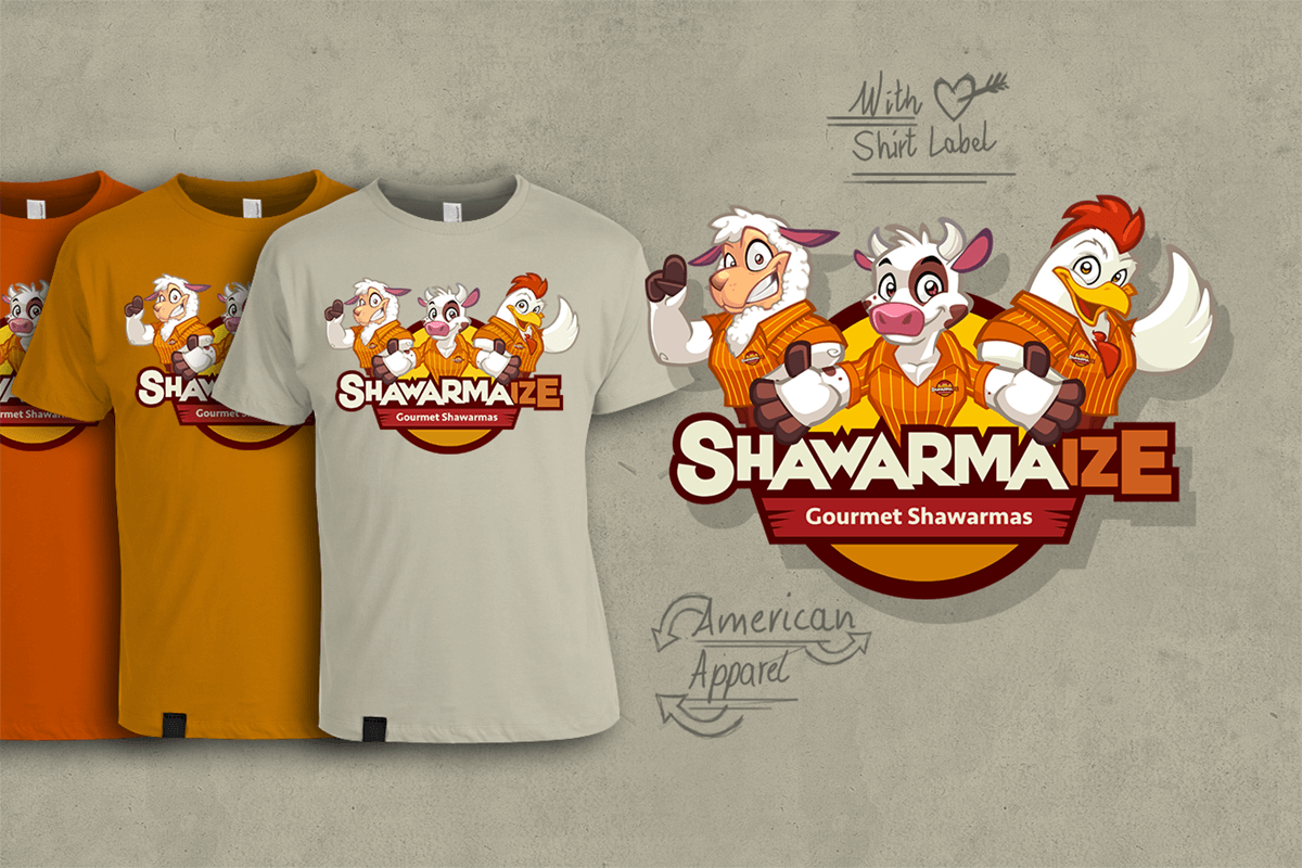
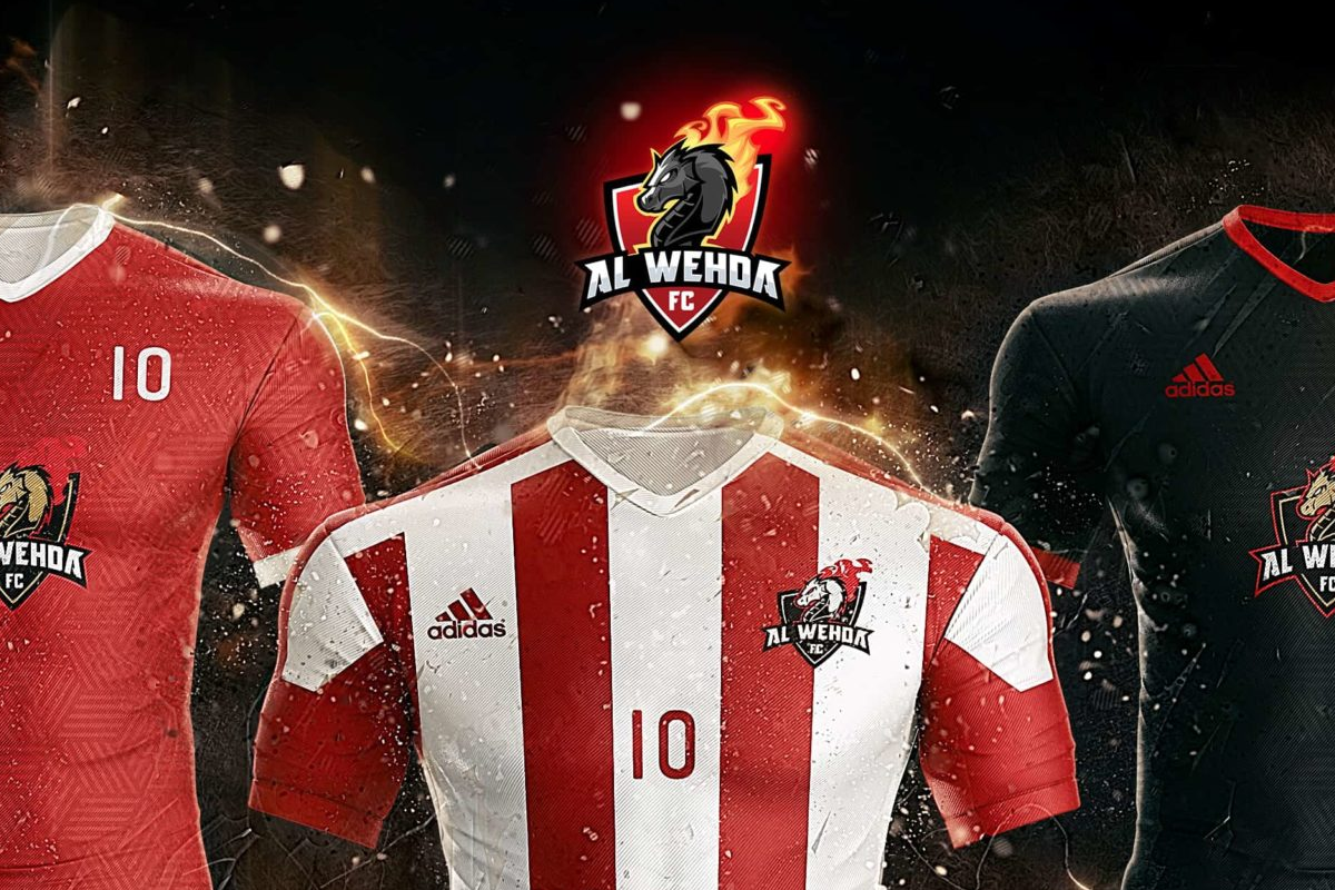
If you’re curious about how this style fits your business, take a look at my custom mascot logos, a more playful and flexible approach to branding.
What Makes a Great Mascot Logo?
To create a mascot logo that lasts, you need to be good at both logo design and illustration, two skills that pull in opposite directions. A great mascot logo design passes five tests:
- Simple: it reads at a glance, with no detail that doesn’t earn its place.
- Legible when small: it still works as an app icon or a social media avatar.
- Works in 1 color: it survives embroidery, stamps and print with no gradients.
- Distinctive: its character belongs to your brand and no one else’s.
- Part of a system: it comes with versions for every format, from the full mascot to the lettermark alone.
The best solution I have found so far is a brand identity kit with a brand element for every scenario: you get the impact of illustration and the versatility of a logo.
Mascot Logo FAQ
What Does a Mascot Logo Look Like?
Usually a cartoon character, often an animal, a person or an object with a face, paired with the brand name. It can be just the head next to the text, a full-body pose or a badge with both, like the six layouts above. Sports teams, food brands and gaming brands use them most.
How Can I Create My Own Mascot?
Start with a brief: who your audience is and what the character should say about the brand. Then sketch ideas from basic shapes, refine the best one with grids and test it small and in 1 color. If you don’t draw, a custom mascot logo designer can take it from the brief.
Kevin. Smith
Posted at 11:16h, 04 AprilGreat content Sergio. How can I learn how to draw like this?
sergio ordonez
Posted at 12:20h, 04 AprilYou are welcome, Kevin. It is all about practice!
Keep in mind I have been drawing since I was a child and I have drawn professionally for 20 years, so there are no shortcuts.
This said, those short exercises can speed up your learning process: http://www.sosfactory.com/drawing-lessons-cartoon-characters/
At the end of the post you will find some extra educational resources.
Cheers.
Sergio
66 club
Posted at 09:32h, 24 OctoberGreat insights on designing a mascot logo! I love the emphasis on understanding the target audience and the character’s personality. The tips on color schemes and typography were particularly helpful. Can’t wait to try some of these techniques for my own project!