

CUSTOM MASCOT DESIGN SERVICES
For Brands, Marketing Agencies & Sports Teams
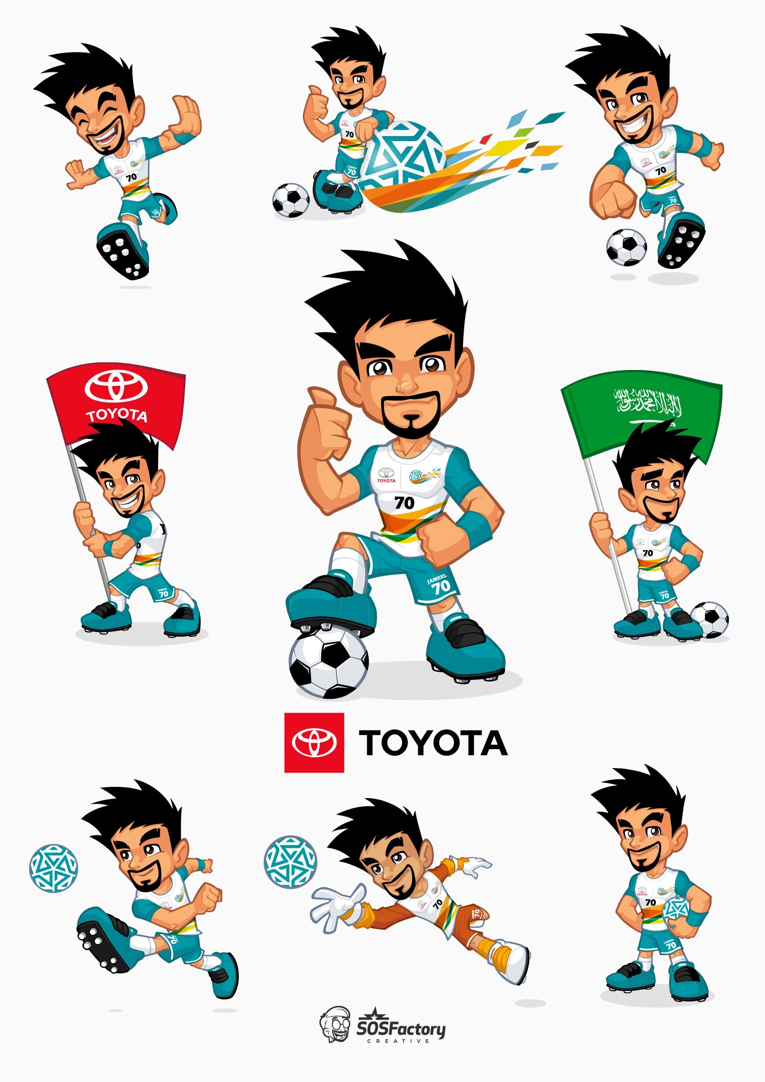
I’m Sergio Ordonez Suanez (aka SOS), a veteran mascot designer with over 20 years of experience in mascot design. I offer a custom mascot design service that helps brands sell, stand out, and connect with their audience.