


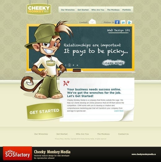
How to create a Vector Mascot in Illustrator
Hi guys! I recorded the whole process in the making of Cheeky Monkey vector mascot in Illustrator. There will be several videos and I will update this post frequently. Subscribing to my SOSFactory Youtube Channel or Facebook page is a good idea to stay up to date.
Learn how I create vector mascot designs in Adobe Illustrator. Work in progress images and videos included.

Nice… huh?
Sadly the video is about 15 hours long, so I need to split it in different parts and accelerate the time to compress it within YouTube´s restrictions. I will write some annotations along the videos where I share some tips to improve your inking in Photoshop and your coloring in Illustrator but I’m sure lot of questions will pop up on your mind, feel free to ask.
Feel free to visit this post to learn more about my mascot design process or visit this character design tutorial.

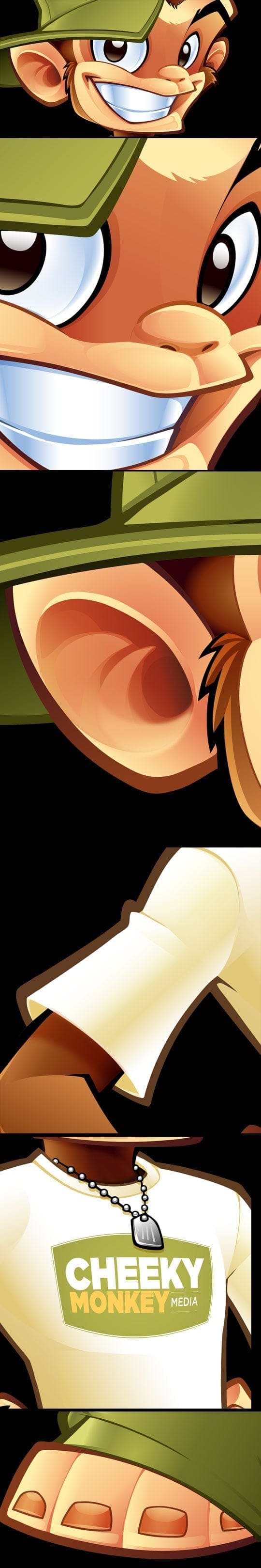
Here you can see the mascot design evolution from the concept
to the final mascot design in Illustrator.
And some close-ups:
Video 1: some tips to improve the quality of your lineart in Photoshop
I receive lot of questions about my digital inking process: how do I get so sharp and crisp lines?. What brush settings do I use?. How big is my canvas?… In this video I reply all these questions and some others, if your lineart looks pixelated or blurry take care of these advices and you will notice a change.
EDIT: Youtube delete all my annotations… sorry, if you really want to learn how to ink digitally I suggest you get my masterclass.
Video 2: how to vectorize your lineart in Illustrator
Vectorizing your lineart in Illustrator with Live Trace is so easy that you don’t really need to deal with vectors until the final conversion. I find much more comfortable and natural working with Photoshop and a Wacom tablet, also the inking process is much faster.
At the end of this step I have lot of white shapes over a black silhouette.

Don’t miss my next Personal Project!!
Shy? ok, alternatively you can follow me at
Video 3: Assigning flat colors in Illustrator
This video could be a bit boring for expert users, I just assign flat colors and organize the shapes into groups, it’s very important when working on complex illustrations.
Video 4: Applying gradient colors in Illustrator (Part I)
I forgot to record the first minutes of this video, I just applied very basic gradients and cut big areas into smaller ones, then I start the tricky part: adding shadows and lights.
Video 5: Applying gradient colors in Illustrator (Part II)
So here is the last video, after 15 hours of work our vectorial mascot design is completely done. Crisp and clean!
I hope you enjoyed the process, I’m already working in the next Masterclass, this time about vector illustration in Illustrator, in the meantime if you have any question or suggestion just let me know.

See you soon!
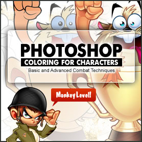
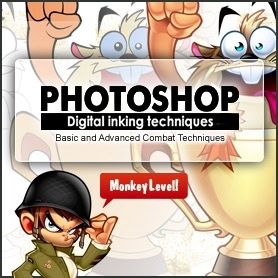
How to become a Professional Mascot Designer?
I created some masterclasses with all my Photoshop tips and tricks about digital inking and digital coloring for mascot design. With my technique and some practice you can also make a living from the characters you imagine.
-
 This product has multiple variants. The options may be chosen on the product page
Learning digital painting in Photoshop
Price range: 6$ through 10$ -
This product has multiple variants. The options may be chosen on the product page
Learning digital drawing with Photoshop
10$
Tim
Posted at 18:21h, 08 DecemberGreat video. It is very helpful in the inking process. Did you do a ruff sketch in pencil first or did you do a ruff sketch in Photoshop? Can’t wait to see the coloring video. Thanks for these.
Sergio Ordonez
Posted at 18:24h, 08 DecemberHi Tim, thanks a lot 🙂
In the past I used to draw and scan the sketches but since I have a Wacom Cintiq 21UX everything is done digitally.
Tim
Posted at 18:32h, 08 DecemberThank you Sergio!
I bet that really speeds up the process. Just started using a Wacom tablet again and I am hooked. The next thing I want to get its a Cintiq!
Darky
Posted at 17:43h, 08 DecemberGracias por tomarte el tiempo de publicar estos excelentes recursos.. Saludos
Sergio Ordonez
Posted at 18:43h, 08 DecemberYes, with standard tablets you don´t have so much control, it´s quite more time consuming but I know artists who can do it. I personally would use vector tools if you don´t have a Cintiq yet.
Toki Tover
Posted at 20:10h, 08 DecemberHello Sergio,
Great tutorial, thank you…
Question, what makes you decide whether or not to color in illustrator versus photoshop?
I remember you stating that you do not really care for illustrator.
Thanks!
Toki Tover
Arvin
Posted at 21:49h, 08 DecemberGreat video! Inking is the thing that frustrates me most in Photoshop… it’s something I can do more intuitively by paper and pen, but who wants to do that? 🙂 I wish Photoshop had a brush system like Flash, which is faster than Illustrator and smooths strokes pretty intuitively.
Question: It looks like you’re in a Cintiq 21ux. I am on the 12wx, and I was wondering if you had experience with the 12wx, and whether upgrading to the 21ux is worth the extra 1000USD, other than the size (which can be both good and bad) and higher resolution. Is it more sensitive, more conducive to producing smooth strokes, etc?
Thanks a lot.
Sergio Ordonez
Posted at 21:53h, 08 DecemberHi Arvin,
Illustrator actually have a brush system, but I tried it a couple of times and desisted because it was a pain.
Flash is really that good?
No, I have no experience on the smallest Cintiq, I think the expense is worth if you have lot of work. Your productivity will increase a lot, if it´s just for a hobby I bet I would stick to the 12″ version.
Arvin
Posted at 22:01h, 08 DecemberFlash’s brush system is very fast and a good compromise between having smooth lines but still feeling organic, in the way that Illustrator isn’t. Plus being able to fill and change colors easily since it’s vector is an advantage over Photoshop. If only its layer system (with annoying blending and transparency modes) were more like Photoshop’s.
At some point in the future I’d love to see a video shot in live action of you doing your stuff… it’d be informative to see your hands, how big your gestures are, how fast your hands move. The screen capture paints only part of the picture!
Sergio Ordonez
Posted at 21:42h, 08 DecemberHi Toki, you are right.
I don´t like Illustrator though it was some advantages, it´s too picky and very time consuming but the design is cleaner and there is no scalability problems. So I use Illustrator when:
1.- The client demands it for any reason.
2.- The client really need it, in case he plains to print really big.
I usually charge a fee for vector illustration since it´s more time consuming. If you don´t plain to print really big stuff, the extra expense is not worth in my opinion.
Cheers!
ikaznarsis
Posted at 02:24h, 09 Decemberwow, its cool!! i like this character, Mongkey cute!!
Sergio Ordonez
Posted at 00:02h, 10 DecemberHi Arvin, it´s a good idea I will think about it!
Adrius
Posted at 00:39h, 12 DecemberEres un genio!! tus videos me son de GRAN utilidad, te estoy muy agradecio! Saludos crack!
Rigomax
Posted at 02:19h, 13 DecemberHOlas genial el videotutorial, me gustaria preguntarte algunas cosas lo que mas me llama la atención es el tipo de pincel que usas y si también utilizas una tablet y cual recomiendas si es así.
un abrazo desde Chile.
sigue adelante 🙂
Sergio Ordonez
Posted at 02:52h, 13 DecemberRodrigo, en el mismo video respondo a estas preguntas y algunas más, ya me cansé de repetirlo 🙂
Fer Osorio
Posted at 07:05h, 15 DecemberHey there Sergio
I could say I’m one of your followers and students. Some months ago I practiced your tut for inking in photoshop and coloring in illustrator (you can see here my deviation http://di5ainer.deviantart.com/#/d34wpdh. I found your blog pretty much inspiring and motivating, as by the time I continue to practice my drawing and illustration. A thousand thanks for every piece of time you dedicate to us newbies.
javier hernandez
Posted at 15:02h, 15 Decembersergio sos el mejor, mi viejo!!!
gracias por tus consejos, como soy empirico en este tema del photoshop, no sabia eso de los colores ahora, en el momento de aplicar el color a mis dibujos y diseños es diferente, gracias por tomarte el tiempo de ayudarme, muchas gracias, sergio, Dios tre bendiga, por dedicarnos tiempo a aquekllos que queremos convertir nuestra pasion en nuestro modo de existencia, muchas gracias!!! este post esta de lujo!!!!
antonio
Posted at 07:58h, 12 Februaryhola sergio oyes por favor una ayuda me podrias decir en que direccion tienes un tutorial donde creo habla de creacion de personajes de 3 cabezas creo infantiles bueno espero me ayudes por favor
Sergio Ordonez
Posted at 11:31h, 12 FebruaryHola Antonio, no tengo ni idea de a qué tutorial te refieres.
En este tutorial sobre el uso del Pincel Histórico: http://www.sosfactory.com/blog/how-to/photoshop-history-brush-tutorial/
Adrymil
Posted at 16:12h, 14 FebruaryBuenas Sergio, quería hacerte una pregunta: ¿el registro de derechos o copyright de las mascotas que haces, corre por tu cuenta? por cuenta del cliente? ambos?. En el caso de que lo hagas tú, ¿cómo se hace?
Sergio Ordonez
Posted at 01:08h, 15 FebruaryYo vendo (casi) todos los derechos, el cliente debería registrar tanto los diseños como sus marcas. En cualquier caso la ley protege la obra desde su creación, independientemente de que se registre, aunque el registro es la mejor prueba de que eres el autor legítimo. Sólo tienes que buscar una oficina de registro de la propiedad intelectual en tu ciudad, no suele ser muy caro, especialmente si agrupas varios diseños y los registras como recopilación.
Saludos!
Adrymil
Posted at 21:45h, 15 FebruaryTodo claro, gracias!!
Saludos! 🙂
Pablo Sergio
Posted at 03:06h, 04 MarchSergio son geniales tus tutoriales! gracias por enseñarnos de tus conocimientos.
Soy estudiante de diseño y amo esta profesión..
Saludos, Suerte.
Pedro Llanos
Posted at 09:54h, 04 MarchSe sabe algo de aquel esperadisimo “The World’s longest Photoshop coloring tutorial”
🙁
Sergio Ordonez
Posted at 12:49h, 05 MarchLo siento Pedro, por ahora el rediseño de SOSFactory es la prioridad, no habrá contenido nuevo durante un tiempo, aunque como ves sigo atendiendo los comentarios.
Toki【ツ】
Posted at 21:14h, 11 MarchHey Sergio,
Can’t wait for video 3 to come out!
🙂
Akrep_484
Posted at 17:03h, 12 Marchhı Will you give me the psd files?
Sergio Ordonez
Posted at 11:45h, 13 MarchNo.
Andrés
Posted at 23:04h, 13 MarchMaestro sergio!!! muy bueno, saludos.
Gustavo Simas
Posted at 16:59h, 16 MarchDaaammnn! DAMNNNNNNNNNNNN! You guyss Help mee a Lot! THANXXXX so Fucking Much! I did knoww about thiss… just Awesomeee!
Thanx guys! Really helps me!
S.O.S Rockss! o/
Mónica
Posted at 21:27h, 16 AprilMe encantó ver los videos… creía que lo hacías de otra forma, pero entintas igual que lo hago yo!!! Veo que no iba por mal camino.
Como siempre buen trabajo y gracias!
Mónica
Rey Enok Madrid
Posted at 06:16h, 23 AprilGreat stuff Sergio… like always
Israel
Posted at 16:11h, 26 AprilHi sergio
My question is:
How you get so soft gradient?, I know that you make a lot of vectors but I don’t know get then soft.
Sergio Ordonez
Posted at 09:44h, 27 AprilHi Israel, just practice 🙂
Israel
Posted at 13:50h, 28 Aprilok thanks, sorry my english
Lian Tluanga
Posted at 10:28h, 27 AprilIma Numberone FAN 😀
Ronald L. Harris
Posted at 21:11h, 04 MayThese tutorial videos art really really good. I’m new at mascot design so this helps so much. Please keep the tutorials coming.
Phil Oliveira
Posted at 17:26h, 02 JuneHey Sergio, Love this stuff!!! I have one question though. I’m using CS3 and I bring in my line art which I did in photoshop off a pencil/ink sketch. I live trace it and expand it and this is where my problem lies… The line art becomes the “shape” meaning I can’t fill in the “planes” with flat color, the only color I can change is the line art it’s self… I can Live Paint it but that leaves a white “Halo” around everything. I’ve been racking my brain and the web for help so I figured I’d just ask you.
Keep up the good work!!!
Cheers
Phil
Sergio Ordonez
Posted at 11:57h, 03 JuneClick on the shape > right click > release compound path.
It certainly will change all shapes to black, change all of them – but the profile, the bigger one – to white. You will spend some time but it’s worth.
Cheers!
matias
Posted at 12:34h, 15 Junehola sergio aparte de tus tutoriales, donde puedo aprender a colorear asi? algun recurso online conoces? gracias de antemano.
Sergio Ordonez
Posted at 07:26h, 17 JunePara aprender cualquier cosa sólo necesitas dos cosas: pasión y dedicación.
Anonymous
Posted at 07:03h, 19 JuneBuenas. Primero agradecerte la ayuda que nos brindas con estos tutoriales y segundo me gustaría hacerte una consulta.
Lo he estado buscando en los comentarios y en el vídeo tampoco me queda muy claro.¿Qué pincel y configuraciones de
pincel utilizas para conseguir que los trazos terminen en una línea muy fina? No sé cómo explicarlo mejor pongo una imagen.
Gracias. Un saludo.
Sergio Ordonez
Posted at 09:24h, 20 JuneNo existe ningún pincel tan preciso. Echa un ojo al video, hago un trazo, después otro y luego con el borrador afilo el corte.
Davicho
Posted at 17:17h, 01 JulyQue sucede si en algun momento nesecitas animar la ilustracion en Flash? que proceso hicieras? me gustaria ver un video tutorial de esto
Sergio Ordonez
Posted at 11:23h, 08 JulyPues que el cliente tendría que contratar a un animador que simplificara el personaje y creara las diferentes partes del personaje, con este nivel de detalle es imposible.
Benchscream
Posted at 09:19h, 18 Julywow! idol!
jazz
Posted at 06:02h, 21 Augusthi! I both have adobe photoshop cs2 and adobe illustrator cs5.. i dont use them to edit photos, i use them to create art from a blank canvas im currently using paint tool sai bcoz it’s easy and simple but it lacks some tools that i need to enhance my work. im pretty good at sketching and drawing using pens and paper but im really not familiar with adobe programs my 1st question is how can i draw in vector mode in photoshop? bcoz dont like to work in raster mode. 2nd is how can i remove the lines that appear when i use the blob brush tool in illustrator? hope you can help me.. bcoz i havent seen any online tutorials about it so far. thanks
Tina
Posted at 01:14h, 12 MarchI see you’re controlling those gradients as if they were shapes with bezier handles. Is that what that is or is there some trick to gradients in Illustrator because they’re just so unfamiliar to me compared to Photoshop gradients. Also, how did you change some of the black lineart to colored gradients like on the monkey’s ear? Looks to be a very good technique to make him look more natural and pop out.
Sergio Ordonez
Posted at 00:12h, 16 MarchHi Tina, it’s not just you… I hate Illustrator, it’s ages behind Photoshop in terms of usability. I colored the lineart just by using a new shape in top of the black lineart, the secret tip is I duplicate the black shape, change the color and then cut it so it fits exactly in the original place.
YonkersDave
Posted at 23:55h, 17 MayIs there a way to watch any of these tutorials in regular speed, without the music?
You are amazing, by the way.
Gritnz
Posted at 02:39h, 27 JuneI download the tutorials from youtube and used VLC video player. You can slow down the play back a little I found it easier to follow
Sergio Ordonez
Posted at 14:53h, 11 JulySorry, it’s not possible right now.
Sergio Ordonez
Posted at 14:55h, 11 JulyIt’s like 15 hours of video… sorry it’s not possible.
Carlos Villanueva
Posted at 01:13h, 26 MayGracias! Estoy tomando en cuenta muchos de estos factores, el primero y principal.. ” no hay trabajo fácil”. Realmente toma tiempo y estoy empezando a usar mi tabla. Te felicito!
Gritnz
Posted at 02:43h, 27 JuneHow long did it take you to do colorize this from start to finish?
Sergio Ordonez
Posted at 14:52h, 11 JulyAround 15 hours.
Maa Graphic1307
Posted at 12:02h, 01 Julyu r best
J Franc
Posted at 00:13h, 15 August10 horas para colorear este personaje? creo que eso aclara todo. 😀
kaenes
Posted at 14:48h, 31 Augustwow..really amazing tut!
Karen Mitchell
Posted at 20:47h, 14 NovemberThank you thank you thank you for sharing. Just what I needed to know!
Karen Mitchell
Posted at 17:45h, 15 NovemberI would like to see it on slow motion so I cen see what your using for some steps!
Jerm
Posted at 17:23h, 11 DecemberSergio,
You continue to be a source of inspiration and information for us all! I’ve been drawing and graphic-designing most my life. I watched your tutorials on the cheeky monkey illustration and was super pumped on your inking technique in Photoshop. I’ve never made the switch to a tablet only because I’ve never used one that made me feel faster. Can you give me any suggestions on the size/brand that you prefer?
Your Characters are RAD! While your insane skill makes me feel a bit novice, it is also inspiring and helps me remember that practice is the only way to get any better. Keep it up!
~Jerm
Jeancarlo Fontalvo Mejia
Posted at 23:40h, 22 MarchHola, Sergio Dios Te bendiga, mira en el Video, no entinedo muy bien como coloreas el Lineart, es decir como le haces para remplazar el color de ciertas areas del trazo, asi como en photoshop…..Gracias de Antemano !!!
nothingness
Posted at 14:51h, 03 JunePLz share video tutorials…
Suzan
Posted at 11:44h, 13 MarchEvery details have been mentioned here with very careful mind. The steps are cleared with the images so well.
Solaiman Sumon
Posted at 10:41h, 02 MayGreat illustrator designing tutorial you have made and published with us . So much thanks for this well posting . Keep continue sharing , thanks .
Mindy
Posted at 23:11h, 25 OctoberI couldn’t see the tips even with annotations on. Are they deleted or maybe I’m not doing it right?
Anyway, is there any way you could briefly write the tips out for the video “12 tips to improve lineart in photoshop”?
Thank you..!
sergio ordonez
Posted at 09:46h, 26 OctoberIt seems Youtube deleted them in one of their udpates 🙁 At the shop I have a premium masterclass about digital inking.
Mindy
Posted at 05:52h, 01 NovemberThanks so much for the reply!! I actually don’t own photoshop… but do you think the masterclass will still be useful?
I need to design a mascot for a website, and I’m struggling with the canvas size to make it look good on the site, even when it’s zoomed in.
sergio ordonez
Posted at 09:42h, 01 NovemberYou are welcome Mindy 🙂
The masterclasses are quite easy to follow, in order to create clean a crips lines you only need a good sketch and 2-3 tools (brush, eraser and optionally the history brush). Any free Photoshop version in the last 15 years will work for this purpose.
Key is using a very high resolution canvas, I use around 10.000 x 10.000 px, when finished you can resize it down to the size you need and it will look cristal clear.
Good luck!
Sergio
Robert
Posted at 05:41h, 22 SeptemberYou are a genious!! Your videos are of GREAT use to me, I am very grateful to you! i love your avatar too…