


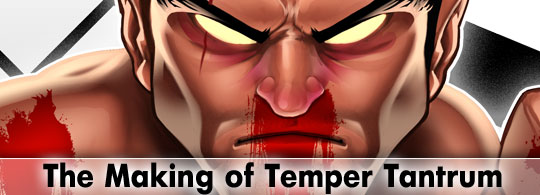
How to create a realistic painting in Photoshop
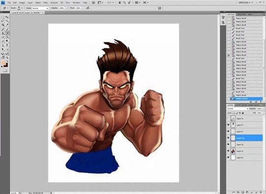
Time for a new tutorial about realistic digital painting in Photoshop. This is a more realistic illustration of a MMA fighter (Mixed Martial Arts). I created this mascot character to be included into an illustrative cartoon logotype, aimed at the printing on T-shirts, of a new brand named Temper Tantrum. You will need a digital drawing tablet to get this kind of rendering.
Digital painting in Photoshop
I have to admit that I’m not completely satisfied with the result, because the process was a bit chaotic, and I had to spent many more hours than I expected. After speeding up the video x10, it still lasted 1 hour, so I had to speed it up x20 to make it suitable for Youtube:
And now let’s explain the way I work when I’m asked for this type of illustrations. As I said before, this is just a serie of steps briefly described more than a tutorial. It would last forever to make a detailed tutorial about this topic.
STEP 1: References
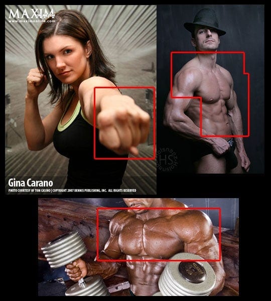
I looked for some references to arrange the pose, when you’re so used to cartoonish style you tend to simplify the shapes too much. After finishing the job, I realize that I should have paid more attention to this step… Lesson learned!!
STEP 2: Sketch
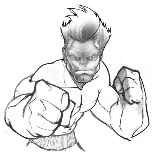
When make a digital painting in Photoshop, I don’t need a very detailed sketch because I’ll remove it at the end. As you can see, the drawing is quite basic, I used Photoshop to make a collage of previous drawings as a template.
STEP 3: Isolating plain colors
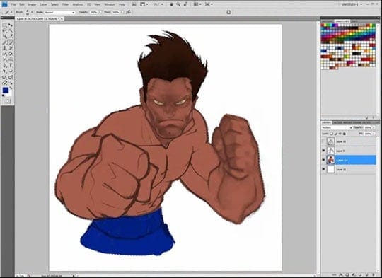
I put the sketch in Multiply mode and I create a new layer below it. On this layer, I’ll paint each area of the character with plain colors of medium intensity. This way we can make quick selections.
STEP 4: Painting basic volumes
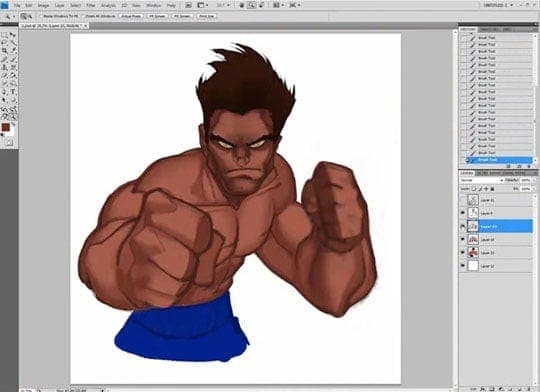
Now I add a new layer above it and I draw with darker colors to give deepness to the volumes. On each stroke, I reduce a bit the opacity of the layer of the sketch, until I make it dissappear.
STEP 5: Adding a bit of light

I add a new layer under the shadows one, on which I’ll paint with a brighter color.
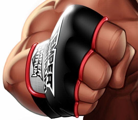
STEP 6: Adding reflections
I add a new layer where I’ll paint the light reflected on the skin. This illumination looks now too soft but at the end I’ll put it on Linear Dodge mode to make it stronger.
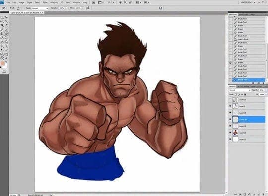
STEP 7: Softing the volumes
Now that I have already ended the color sketch, I’ll flat all the layers except the reflections one, and I go mixing and softing the gradients, adding more and more detail. I disable the reflections layer for this, notice how it looks when I enable it again and I put it on Linear Dodge mode:
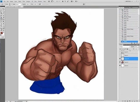
STEP 8: Cleaning and adding volume
I continue softing the gradients, I correct the anatomy, and I add darker and brighter tones to reinforce the volumes.
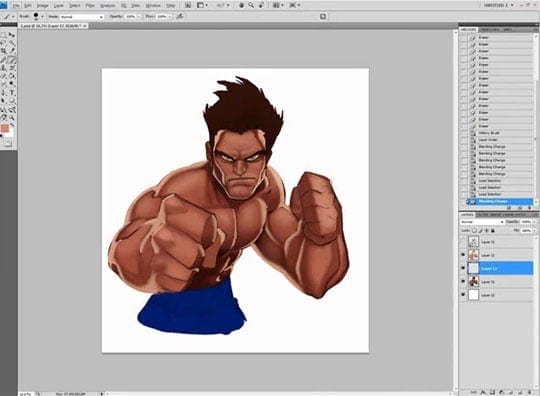
STEP 9: Details
For the clothing I follow the same procedure, plain colors on the general shapes first, and then I go adding volume and details.
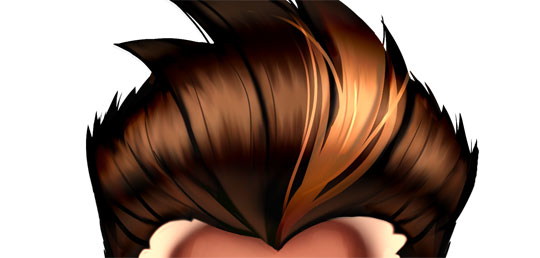
For the hair, I add layers in different fusion modes (Screen for the reflections and Linear Dodge for the blonde hair lock) and I use the Smudge Tool to fuse the shades.
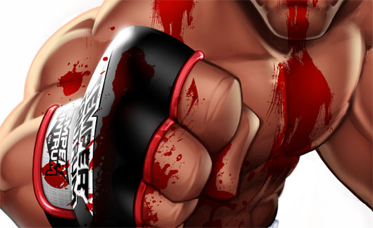
For the blood, I use a layer in Multiply mode with red color saturated to the maximum.
STEP 10: Change of plans
The client made some changes:
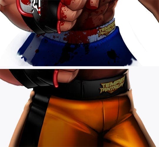
The pants gave me a little trouble, I liked better the first one, but the client chose the second.
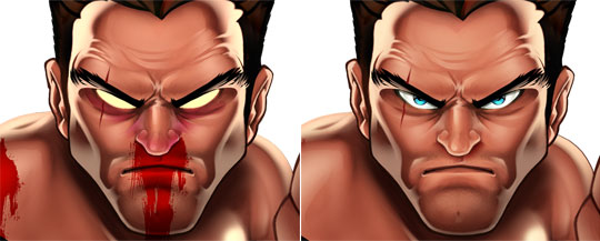
Same for the face, I liked better the first one, but he chose the second.
STEP 11: Design of the logotype
![]()
Any questions?
I guess there are lots of them, hehe. If you need me to describe any steps, you only have to leave a comment.
JMChakon
Posted at 16:43h, 18 OctoberCada vez que veo más trabajos tuyos, más admiro tu trabajo… este me sorprendió cuando lo ví en tu portfolio por la diferencia de estilo de dibujo, como comentas… ya no es tan cartoon. Y el manejo de la tableta? pa que decir… 😛 una cosita… lo modos de fusión que comentas están en inglés, sabes cuales modos de fusión son en la versión en castellano de photoshop? me hago una diea de cuales son… pero para asegurarme 😛 Grandísimo trabajo!!!
Alexei
Posted at 15:21h, 18 Octobercool logo
Sergio Ordonez
Posted at 20:18h, 18 October[lang_en]Hello JM, thanks a lot buddy :).
Multiply = multiplicar, Overlay = superponer, Screen = Aclarar[/lang_en][lang_es]Hola JM, muchas gracias 🙂
Multiply = multiplicar, Overlay = superponer, Screen = Aclarar[/lang_es]
Diana
Posted at 01:03h, 19 OctoberEl proceso es muy interesante, Sergio 🙂 me preguntaba si es posible hacer una ilustración así con una tableta wacom bamboo 😛 o solo se puede lograr con la Cintiq? otra preguntita: ¿cómo se llama esa fuente del logo? Saludos, está genial este post.
Sergio Ordonez
Posted at 10:28h, 19 October[lang_en]Hello Diana, of course you can. The font is Batman Forever.[/lang_en][lang_es]Hola Diana, claro que sí, todo es cuestión de ponerse. La fuente se llama Batman Forever :)[/lang_es]
Diana
Posted at 12:39h, 19 Octoberhello, gracias, ¿Batman Forever? ya decía que se me hacía conocida.
Sergio Ordonez
Posted at 10:32h, 21 October[lang_en]Hello Sebastian, the key is what you can do, no matter the tools you use. But a bigger monitor, a better tablet or a good Photoshop skills can increase your efficiency, and you will enjoy more.[/lang_en]
[lang_es]Hola Sebastian, lo importante no es lo que uses si no los resultados. Eso sí, un monitor más grande, una tabla más precisa o manejar bien Photoshop aumentará tu eficiencia y ya de paso, disfrutarás más.[/lang_es]
sebastian
Posted at 06:47h, 21 OctoberHOLA Sergio escribo desde argentina, hace unos meses que te decubrí y me estoy poniendo al día con todos tus post, que por cierto coincido en la mayoría de los puntos, hace 5 años que me dedico al freelance, particularmente aquí en sudamérica solo subsistimos gracias al trabajo del exterior aquí y en todo el mundo el reubro está muy bastardeado pero al cambio nos sirve por ahora.
Bueno a la pregunta, mi fuerte es el diseño grafico y electrónico (mucho illustrator y photoshop) hace un tiempo empecé con las ilustraciones pero siempre con illustrator.. Mi pregunta es si para llegar a tu nivel hay que usar si o si el photoshop + tableta, yo tengo una tabla de 6″ una de las mas chicas y me menejo con una Laptop de 13″ en la mayoría de los casos. Bueno espero sigan tus exitos y estamos en contacto. SALUDOS!
Sergio Ordonez
Posted at 14:05h, 21 October[lang_en]Exactly Daniel, in this case there is no inking, I go directly from the sketch to the final painting.[/lang_en]
[lang_es]Exáctamente Daniel, en este caso no hay entintado, del boceto paso al color directamente.[/lang_es]
Daniel
Posted at 14:00h, 21 OctoberMe doy cuenta de que en tu caso el inking tiene poco peso, relativamente. Al final, formas y constitución son definidas por el color, que conforma la estructura y profundidad del dibujo. ¿No?
Fernando
Posted at 17:25h, 26 OctoberHola Sergio. Tus ilustraciones son muy buenas, pero esta es impresionante,te felicito. Y ya me dieron ganas de practicar, tengo una Tableta Genius uqe me la compré hace un tiempo para comenzar. Saludos
Jose Rodriguez
Posted at 20:17h, 26 OctoberEspectacular su diseño, me gustaria saber si me puede informar de cuales son los programas que se necesita para poder realizar esos espectaculares diseños. Le agredeceria muchisimo su informacion, ya que me estoy iniciando y no tengo mucha nocion. Nuevamente lo felicito. Si es posible, me gustaria saber que tipo de pc se necesita para trabajar, que hardware es el recomendado. Muchas Gracias…
Sergio Ordonez
Posted at 02:25h, 27 OctoberHola Jose, lo que necesitas es un PC de gama media, incluso gama baja. Lo más importante es hacerte con Photoshop y una tabla Wacom. El resto es sólo práctica.
Marco Cortes
Posted at 22:59h, 27 OctoberWao man es asombroso lo que estas haciendo con tu trabajo. muchas gracias por compartirlo con todo el mundo.
harvey
Posted at 09:00h, 29 OctoberA great technique once again from the master 🙂
thanks for the tutorial, helped me a lot!
Scorsese
Posted at 22:48h, 02 NovemberIncreible tu forma de pintar, ayudame con mi pedido por favor.
Legion
Posted at 16:34h, 09 NovemberHola
Estoy haciendo algo de ilustracion en photoshop siguiendo tus consejos (¡¡gracias!!), PERO me encontre con un problema. cuando uno las capas, el degradado entre colores a veces queda grosero. ¿Como puedo suavizarlo? Uso “desenfocae” pero le quita realismo. ¿Hay alguna herramienta tipo difumino o que mezcle colores?
Un abrazo
Legion
Sergio Ordonez
Posted at 16:57h, 09 NovemberHola Legion, no sé si te refieres a que tienes algún problema de gestión de los perfiles de color o simplemente sea falta de técnica.
En el segundo caso, para mezclar los colores puedes usar el “blur tool” o el “smudge tool” pero me temo que es cuestión de práctica.
Legion
Posted at 18:52h, 09 NovemberHola Sergio!!
¡Gracias por la respuesta! si, me referia a la mezcla de colores.
¡¡Asi que las herramientas son dedo y desenfocar!! bueno… a practicar entonces!
Un abrazo
Legion
Diana
Posted at 01:17h, 11 NovemberEl pelo es genial, se parece al del personaje que hiciste como wallpaper para psdtuts 😛 si mal no recuerdo
Diana
Posted at 01:20h, 11 Novemberuna pregunta: ya q este estilo no lo había visto antes en tus trabajos, ¿fue el cliente a quien se le ocurrió que fuese así, realista?
DesignBoy
Posted at 12:40h, 13 NovemberTruly amazing, the detail is emence.
Marco A. Rodriguez (sLiFeR)
Posted at 01:39h, 17 NovemberHola que tal primeramente quiero darte las grasias por apoyarnos con este gran tutorial y los demas un gran trabajo ,empeño, y lleno de calidad miles de grasias, segundamente realizas unas ilustraciones a detalles impresioanntes veo que cambias de estilo de digital paint degradados etc exlentes tus tecnicas bro pues muchas felicidades por tu gran trabajo nos vemos luego salu2
Bertrand Belancourt
Posted at 17:37h, 22 NovemberSimply INCREDIBLE man….I LOVE IT !!! GOOD JOB!!!
emmanuk
Posted at 00:38h, 26 NovemberMe gusta mucho tu laburo sergio. Que sepas que por aca (Argentina) y por lo menos de mi parte te estoy muy agradecido por los consejos, los tips, la humildad y la sinceridad.
Se agradece y se aprecia.
Salu2~
radioflash24
Posted at 15:34h, 10 December10 horas para eso?
o.o
dios
ahora ya se por que esta bueno =)
Joe
Posted at 12:32h, 27 Decemberseriuosly you only use PHOTOSHOP? Never with illustrator for this tuts!? Incredible..
Enrique
Posted at 17:25h, 12 JanuaryImpresionante tutorial, creo que tienes un sitio en mis favoritos…jejeje espero hacerlo pronto!!
PSDDude
Posted at 07:31h, 13 JanuaryIt looks cool! I like it very much even though is not my style:)
inedeo
Posted at 02:34h, 05 Februarywow!!!! muy buen trabajo Sergio cada vez me sorprendes mas!
mous
Posted at 16:47h, 02 Decemberi want to download the full video and it shows me that…The file you are trying to access is temporarily unavailable. Please try again later.
could be fixed? also i love your kind of art and i want to see it to get ideas and know much better for photoshop
Sergio Ordonez
Posted at 17:29h, 02 DecemberHi Mous, it´s available for me. Try later.
mous
Posted at 18:50h, 02 Decemberit’s ok…i downloaded it …by the way you are very good at art
macCelo
Posted at 19:25h, 08 December¡Amazing!
Congratulation for this tutorial!!
Ahmed Ali
Posted at 19:23h, 17 Januaryi heard that the intuos 4 tablet nib gets used pretty quickly and the intuos 3 is better because the nibs in intuos 3 tablet are more durable. So which tablet do you use. And which would you recommend because i am thinking of buying but confused as to which one to buy.
Sergio Ordonez
Posted at 21:34h, 18 JanuaryHi Ahmed, I have an Intuos 3 A6 but I used Intuos 4 nibs and I didn’t notice any difference in terms of durability. When I used tablets I didn’t replace them too often, with hard use your tablet will get some scratches anyway so it’s not a big deal.
For monitor tablets like Cintiq series (the one I use right now) this is different because the surface of the monitor is very delicate and expensive to replace. The best solution is buying a cover sheet, it’s around 20US$, much cheaper than replacing nibs every week.
I suggest you read this article: http://www.sosfactory.com/best-drawing-tablet/
and this one: http://psd.tutsplus.com/articles/tools/how-to-choose-a-graphics-tablet-that-fits-your-needs/
If you are on a tight budget I suggest you try the Intuos 3 or even the Wacom Bamboo.
Nuttadech Junlawan
Posted at 02:40h, 04 AugustSucoei
Dibumost
Posted at 04:37h, 29 Octoberespectacular!!
Riko_pop
Posted at 06:53h, 30 Januaryhola! gracias por compartir tu trabajo ya que nos es de mucha ayuda a los que trabajamos o nos gusta la ilustracion, aprendemos mucho con tus tutoriales, realmente es de mucha ayuda, poca gente comparte sus trabajos y procesos como lo haces tu, queria pedirte si puedes poner el video para descargar en otro servidor ya que como todos sabemos magaupload ha sido cancelado, te lo agradeceria mucho, me gustaria ver el video, bueno me despido y otra vez muchas gracias, excelente tu post y tus trabajos, mucha dedicacion, gracias por compartir!!!
James
Posted at 02:37h, 07 SeptemberHi” your upload link is not working for megaupload.com the US goverment has closed them down for fraud !
so I suggest you use a different site for your video uploads and for your fans to download to watch.
Michael Ekenobi
Posted at 16:01h, 17 Mayhi Sergio, i love this. I wonder how you achieve great clearity and awesome resolution in your colourings. and how do you make the colours come out so nice. i would like to know.
jhonny
Posted at 19:23h, 28 Mayporfavor puedes hacer unos tutos paso por paso de como lograste hacer ese logoo tan imprecionante?? seria algo genial tu eres un experto en el diseño sos increible hermano.